
Key Takeaways:
- Your wedding invitation color sets the tone for your entire celebration and gives guests their first glimpse of what to expect, so choosing a palette that reflects your venue, season, and overall aesthetic matters.
- A cohesive invitation palette typically includes three or four colors with a clear hierarchy: one dominant shade, one or two supporting colors, and an optional accent for visual interest.
- Colors appear differently on screen than in print, and paper stock and printing methods affect the final result, which is why ordering samples before placing a full order is always worth it.
Color plays a huge role in the overall impression your wedding invitation will leave on your guests — which is why couples (and wedding planners!) spend so much time picking out the perfect color palette. In some cases, these palettes lean on the couple's favorite colors as a starting point. In others, the venue location, wedding date, and reception theme (rustic, beach, vintage, boho, etc.) can steer the decision-making.
Whether you have your color palette picked out or are still unsure about what direction to go, this article will provide you with plenty of ideas for how to leverage color in your wedding invitations. Prepare to get inspired.
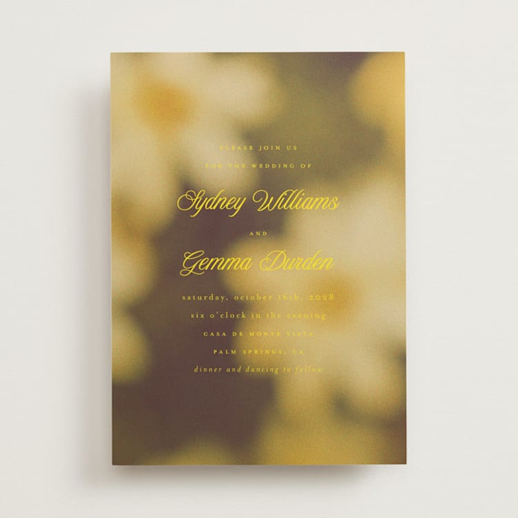
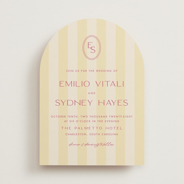
Minted + BRIDES Color of the Year: Island Citrus
Bright, optimistic, and bursting with energy, Island Citrus is the shade that's defining weddings in 2026. A nod to sun-drenched days, succulent native fruits, and vibrant flora and fauna, this zesty yellow-green hue embodies paradise — and the wedding experts at Minted + BRIDES are completely smitten. Whether you're dreaming of a tropical celebration or simply want to infuse your big day with warmth and joy, Island Citrus brings an instant sense of sunshine to everything it touches.
Island Citrus Color Schemes
- Island Citrus + Crisp White + Natural Green. Let the hue shine in all its glory by pairing it with clean white and leafy greens. This fresh, organic palette feels like a tropical garden in the best possible way.
- Island Citrus + Coral + Turquoise. Lean fully into the paradise vibe with a palette that channels Caribbean waters and exotic blooms. This combination is bold, joyful, and perfect for destination weddings or couples who aren't afraid of color.
- Island Citrus + Warm Neutrals. Ground the brightness of Island Citrus with sandy beige, soft taupe, or creamy ivory for a palette that feels warm and sophisticated. This pairing works beautifully for beach weddings or celebrations with a relaxed, organic aesthetic.
- Island Citrus + Navy + Gold. For a more unexpected take, pair the zesty shade with deep navy and metallic gold accents. The contrast creates a refined, preppy palette that balances playfulness with polish.
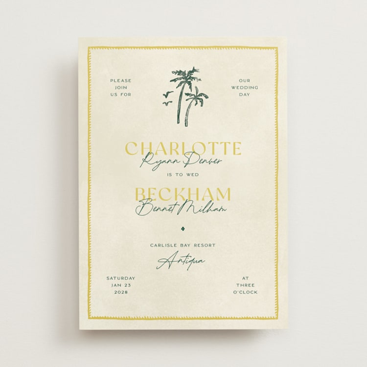
Wedding Themes That Pair Perfectly With Island Citrus Invitations
- Tropical or Destination Weddings. Island Citrus was practically made for celebrations set against palm trees, ocean breezes, and sandy shores. Use it as your dominant color or as a vibrant accent alongside lush greens and bright corals.
- Citrus-Themed Weddings. Lemon trees, kumquat centerpieces, and limoncello toast bars are having a major moment, and Island Citrus ties the whole aesthetic together beautifully.
- Garden Weddings. The shade's natural, sun-kissed quality makes it a perfect fit for outdoor celebrations surrounded by greenery and blooms. Pair it with soft whites and botanical illustrations for an invitation that feels fresh and romantic.
- Summer Celebrations. If your wedding is happening during the warmest months, Island Citrus captures that carefree, sunlit energy. It's cheerful without being overwhelming and pairs well with both casual and formal settings.
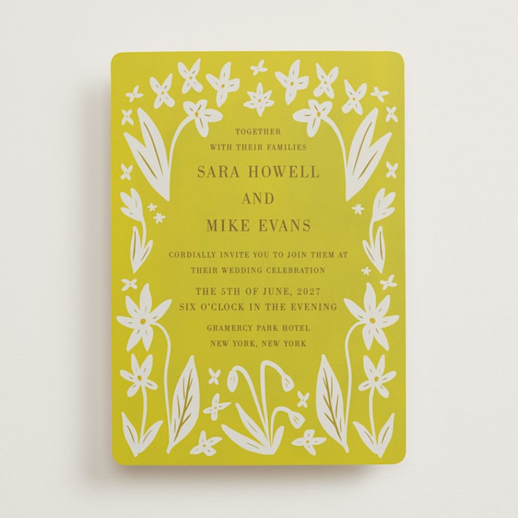
Yellow Wedding Invitations
Cheerful, optimistic, and undeniably warm, yellow brings an instant sense of joy to wedding invitations. It's a color that feels like sunshine on paper, which is why it's a perennial favorite for spring and summer celebrations. But yellow is more versatile than it often gets credit for. Softer buttery shades can feel elegant and understated, while bold marigold tones bring energy and vibrancy. The key is finding the right shade for your wedding's overall mood.
Popular Shades of Yellow for 2026
- Island Citrus. Minted + BRIDES' 2026 Color of the Year is a bright, zesty hue that captures the energy of tropical getaways and fresh citrus groves. Optimistic and vibrant, it brings instant warmth to any invitation suite.
- Buttercream. This soft, creamy yellow reads almost as a warm neutral, making it incredibly versatile and easy to pair with a wide range of colors.
- Marigold. Rich and saturated, marigold brings warmth and energy without veering into neon territory. It's a beautiful choice for fall weddings or celebrations with a bohemian vibe.
- Lemon. Bright and zesty, lemon yellow is perfect for couples who want their invitations to feel fresh, modern, and full of life.
- Mustard. This earthy, slightly muted shade of yellow has a vintage quality that pairs beautifully with rust, burgundy, and forest green.
Yellow Color Schemes
- Buttercream + White + Greenery. This soft, romantic palette feels like a garden in early summer. It's understated but still warm and inviting.
- Marigold + Cobalt Blue. For couples who aren't afraid of bold color, this high-contrast pairing is striking and memorable. It works especially well for destination weddings with a Mediterranean or Mexican influence.
- Lemon + Lavender + White. A cheerful palette that feels fresh and youthful, perfect for spring and early summer celebrations.
- Mustard + Burgundy + Cream. This earthy combination is ideal for fall weddings and pairs beautifully with rustic venues like barns, vineyards, and farms.
Wedding Themes That Pair Perfectly With Yellow Invitations
- Modern/Contemporary Weddings. Yellow might not be the first color that comes to mind for minimalist aesthetics, but a well-chosen shade like lemon or buttercream can add unexpected warmth to clean lines and modern typography.
- Citrus-Themed Weddings. Lemon groves, orange slices, and limoncello favors call for invitations in sunny shades of yellow paired with bright greens and crisp whites.
- Tuscan or Mediterranean Weddings. Yellow ochre tones are a staple of Italian countryside aesthetics, making them perfect for weddings inspired by la dolce vita.
- Garden Weddings. Yellow blooms like roses, dahlias, and ranunculus are garden favorites, making yellow invitations a natural complement to celebrations surrounded by lush florals and greenery.
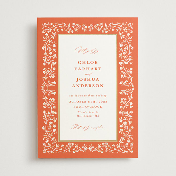
Orange Wedding Invitations
Warm, energetic, and undeniably joyful, orange is having a major moment in weddings. Once considered too bold for bridal stationery, the color has found its footing as couples embrace richer, more expressive palettes. From soft apricot to fiery tangerine, orange brings warmth and personality to wedding invitations and pairs surprisingly well with a wide range of colors and aesthetics.
Popular Shades of Orange for 2026
- Verona Sunset. The Minted + BRIDES 2025 Color of the Year is still holding strong. This punchy, saturated orange calls to mind luxe Mediterranean getaways and crisp aperol spritzes — simultaneously energetic and sophisticated.
- Terracotta. Earthy and grounded, terracotta has become a staple for rustic, desert, and bohemian weddings. It reads more neutral than other oranges, making it easy to work into a variety of palettes.
- Tangerine. Bright and bold, tangerine is for couples who want their invitations to make a statement. It's cheerful, modern, and works beautifully for summer and tropical celebrations.
- Apricot. Softer and more subtle, apricot offers the warmth of orange without the intensity. It pairs beautifully with blush, cream, and gold for a romantic, sun-kissed look.
Orange Color Schemes
- Verona Sunset + Warm Beige + Chocolate Brown. Lean into the shade’s luxury heritage (looking at you, Hermés boxes) with a palette that pairs warm neutrals like sandy beige and rich chocolate brown with the fiery orange hue.
- Terracotta + Sage + Cream. This earthy combination feels organic and relaxed — perfect for desert weddings, outdoor celebrations, or venues with natural wood tones.
- Tangerine + Bright White. This color combination strikes just the right balance of bold and sophisticated, making it perfect for a chic city wedding or a modern summer celebration.
- Apricot + Dusty Rose + Gold. Soft and romantic, this palette feels like a sunset captured on paper. It's lovely for garden weddings and spring celebrations.
Wedding Themes That Pair Perfectly With Orange Invitations
- Country Club. Give a country club venue a modern prep twist by saturating classic details like custom crests, stripes, and crisp typography in the vibrant shade.
- Festive Cocktail. A bright and bold color palette that incorporates orange alongside sunny yellows, vibrant greens, and cheerful pinks is perfect for a wedding day that is every bit as playful and fun as you and your spouse-to-be.
- Garden Inspired. Because orange is a shade that is found abundantly in nature (think marigold flowers, zinnias, lilies, and poppies), it pairs perfectly with other garden-inspired shades like cornflower blue, grass green, and rosy pink.
- Mediterranean Coastal. Whether you’re lucky enough to be hosting a destination wedding on the Amalfi coast or are just bringing la dolce vita stateside, orange is the perfect color to incorporate into your big day.
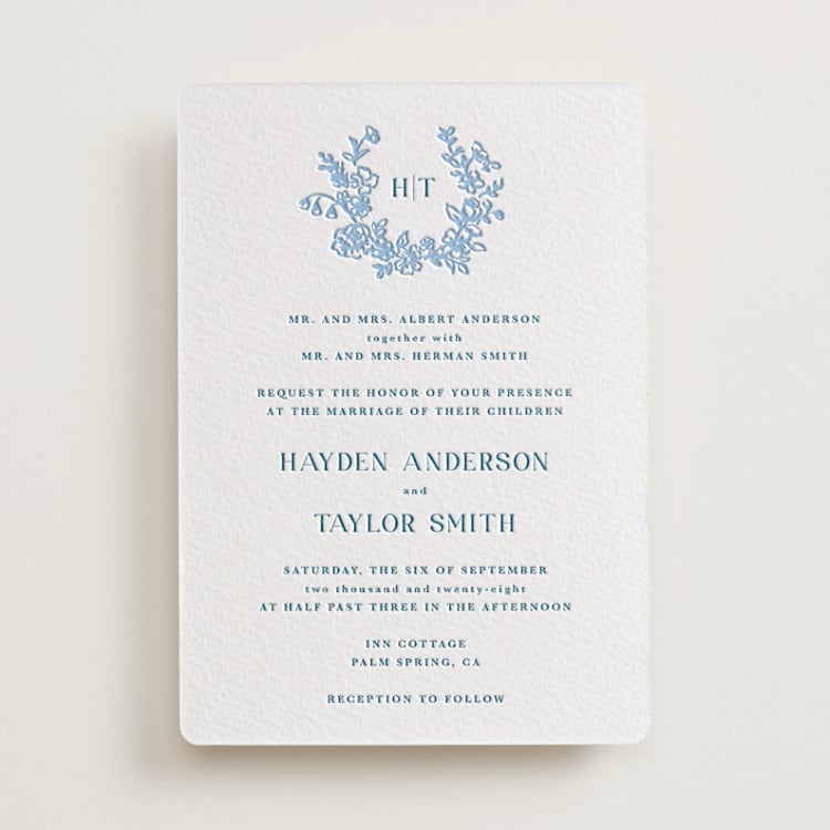
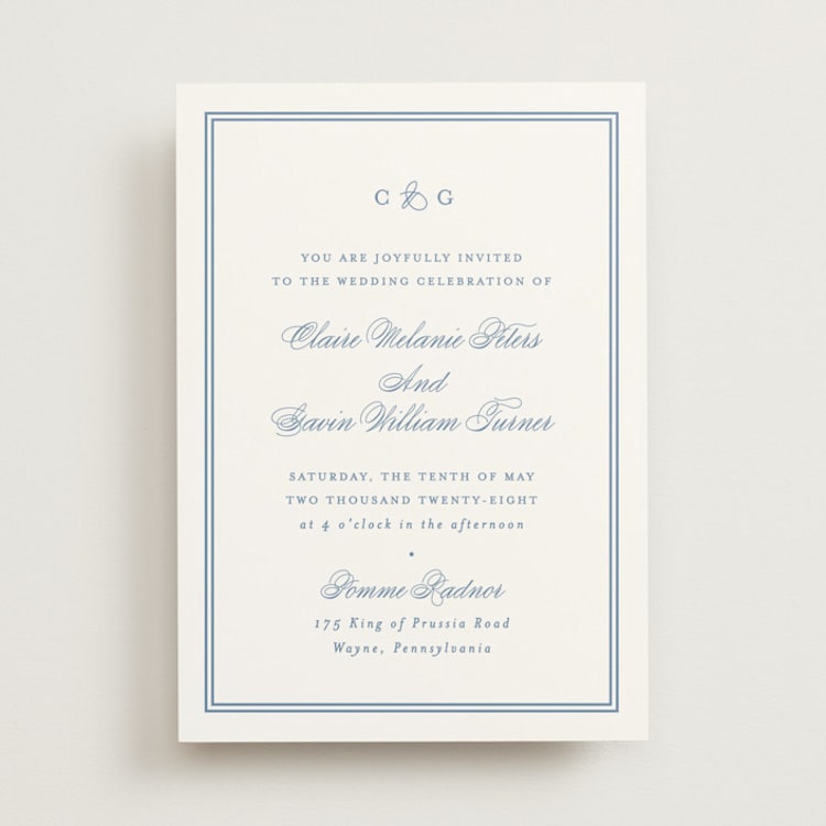
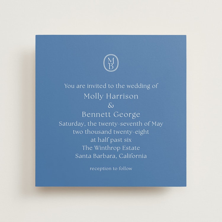
Blue Wedding Invitations
Blue wedding invitations in nearly any shade will never go out of style. Associated with serenity and tradition (hello, “something blue!”), there’s a shade of blue that is fit for nearly every wedding.
Popular Shades of Blue for 2026
- Navy. Deep and sophisticated, this shade is every bit as versatile as black, without being quite so harsh.
- Robin’s Egg. The vibrant, green-blue shade is always a winner for spring and summer weddings.
- Powder Blue. One of the most versatile shades of blue, powder blue is a bit of a chameleon, serving as a neutral in bolder color schemes or standing on its own in softer palettes.
- Marseille Bleu. This vibrant cobalt shade was Minted + BRIDE’s color of the year in 2024, and we’re still loving it for 2026 celebrations.
Blue Color Schemes
- Marseille Bleu + Lemon Yellow + Leafy Green. Bringing to mind sparkling summers spent on the Riviera, this palette is perfect for weddings channeling a European summer vibe.
- Navy + White or Cream. You can never go wrong with a blue-and-white color scheme on your invitation. Going for a darker shade can give the simple color palette a slightly more formal feel, even when paired with handwritten-inspired typefaces.
- Powder Blue + Robin’s Egg + Navy. Combining several blue shades creates an aquatic-inspired palette perfect for invitations that lean into a beachy or ocean theme.
- Blue + Green + White. If you’re looking for a traditional take on a botanical-themed wedding invitation, go for this color palette. There is lots of room to play with the exact shades here — softer blues and greens are beautiful for spring, while richer tones are great for more traditional weddings.
Wedding Themes That Pair Perfectly With Blue Invitations
- Winter Weddings. We often associate blue with cold, ice, and starry nighttime skies, which makes a dramatic blue wedding invitation perfect for a winter wedding.
- Beach/Lake Weddings. Help set the tone for a wedding hosted on the water with an invitation in a shade of blue that calls to mind ocean waves or ripples on the surface of a lake.
- Modern Formal Weddings. A navy and white color palette is a great way to modernize traditional black and white wedding invitations, without sacrificing any of the elegance or formality.
- Rooftop Weddings. If your wedding celebration involves some stargazing, bring that romance and elegance into your wedding invitation colors with navy blue cardstock accented by gold or silver foil press elements.
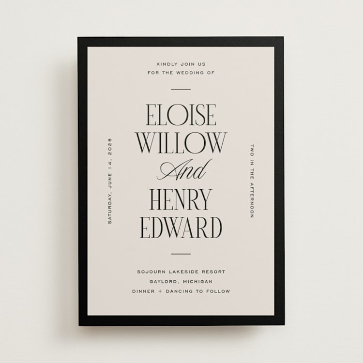
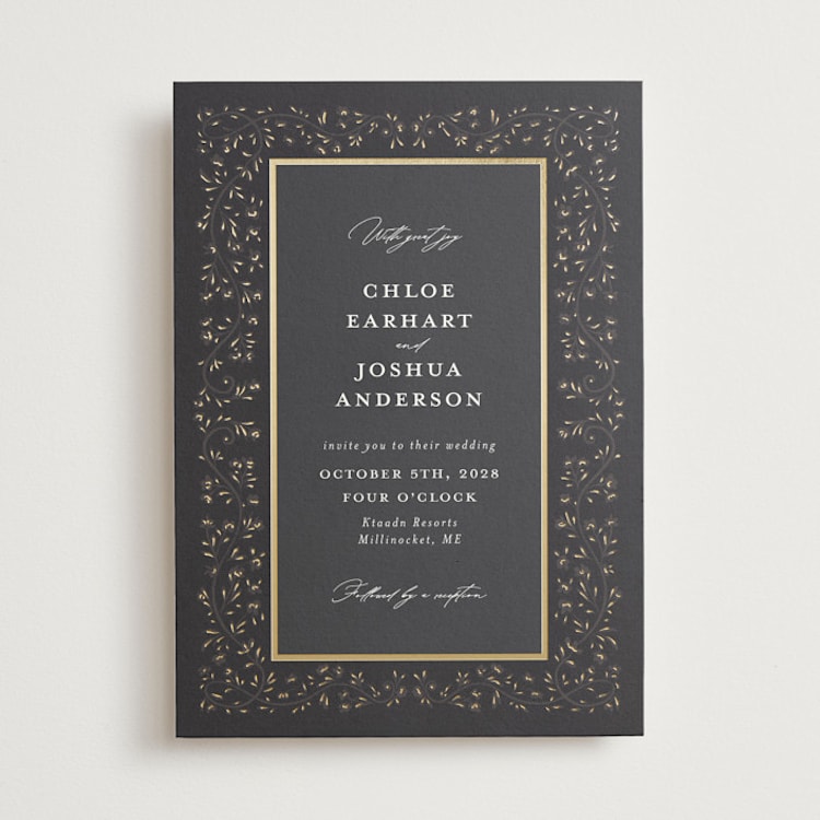
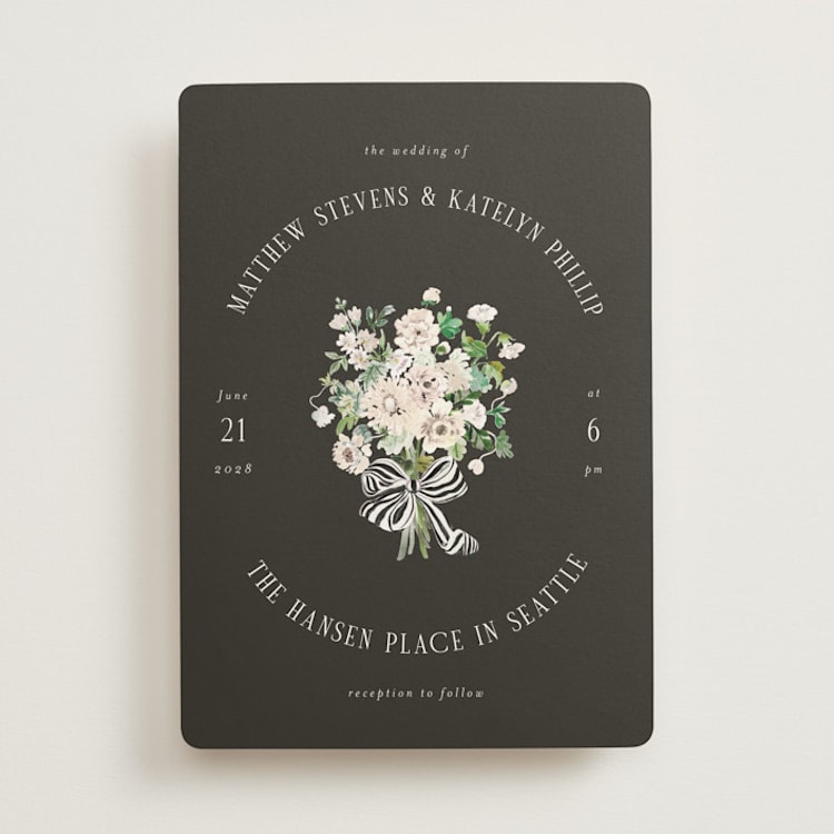
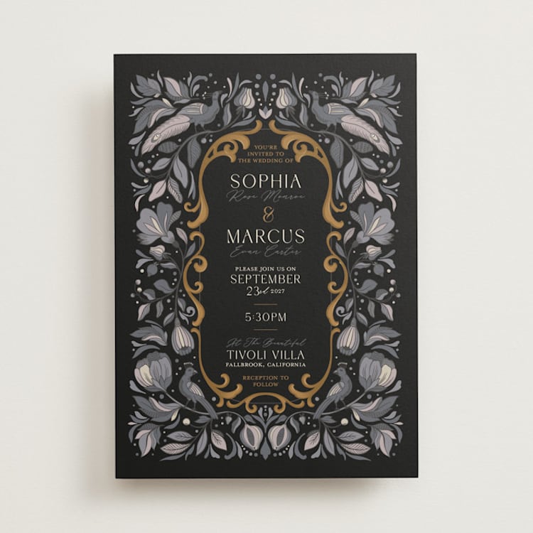
Black
Sophisticated and always classy, black can be used to communicate everything from elegance and formality to mystery and romance. (Which explains why we’re perennially obsessed with black tie weddings and little black dresses.) Black can be used as an accent color in most invitations, regardless of your overall color palette, but don’t be afraid to use it as your primary shade!
Black Color Schemes
- Black + Metallic Foil. Hello, drama! This is the perfect color palette for a wedding that is leaning into all kinds of opulence and glam. Look for an invitation that uses black as a background color against which gold, silver, or even rose-gold foil accents can really pop.
- Black + Sage Green. For an unexpected take on a botanical wedding invitation, go for a style that contrasts soft organic green tones with a black background.
- Black + White. Does it get more classic than this? A white invitation printed with black letterpress text on luxe cardstock will always be a winning combination. But, for something more modern, look for a style that reverses the roles by using black as the background color and white for the typography.
- Black + Smoke. This soft palette is perfect for an earthy, vintage-inspired wedding. We love how it looks in invitation designs that feature decorative elements and watercolor details straight from the Victorian era.
Wedding Themes That Pair Perfectly With Black Invitations
- Black Tie Weddings. Stay true to the formal sophistication of a black tie wedding by choosing an invitation style that features black typography and elevated details like letter-pressed printing and thick cardstock.
- Gothic or Fantasy-Inspired Weddings. If you’ve booked your dream castle wedding venue or are going for a moodier take on a garden party, black is a great way to create a mysterious, opulent atmosphere, especially when paired with darker reds, greens, and blues.
- New Year’s Weddings. If you and your partner are planning to tie the knot around January 1st, you may be inspired by the more traditional New Year’s celebration color palette of black and silver.
- Art Deco Weddings. When you think of flapper dresses and Great Gatsby-inspired celebrations, the color black always comes to mind. An Art Deco-themed invite with geometric rose gold foil accents will hammer this theme home.
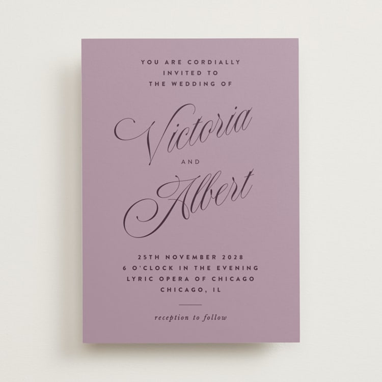
Purple Wedding Invitations
Associated with royalty, luxury, and power, purple represents wealth and extravagance. The color purple rarely occurs in nature, and because of this, it is seen as coveted and sacred. Visually, it is an uplifting color that sparks the imagination, a sense of magic, and new levels of creativity, making it perfect for weddings that embrace creativity at every turn.
Trending Shades of Purple for 2026
- Dusk. This moody, intense shade of purple rides the line between deep purple and midnight blue, perfect for couples looking to add a touch of drama to their wedding color scheme.
- Lavender. This bright, cheerful shade is perfect for spring and summer weddings and pairs as well with pastels and neutrals as it does with punchier, wildflower-inspired hues.
- Burgundy. Burgundy will forever be a favorite for fall and winter weddings, and is a great way to lean into the opulence of purple without going overboard.
Purple Color Schemes
- Hazy Lilac + Rich Greens + White. This muted, floral-inspired palette works well for wedding invitations no matter the season.
- Future Dusk + Metallics. Play up the richness of dusky purple with an invitation that contrasts the deep shade with super-shiny foil-pressed details. Pair dusk with gold for a fall-inspired invitation, silver for something that leans into the future dusk trend, or rose gold for an unexpected twist.
- Burgundy + Rose + Green. Deep burgundy and rosy pink are a match made in heaven — look for a design that pairs the two shades with green for an organic feel.
- Lavender + White. Either shade can take center stage in this fresh and youthful color scheme.
Wedding Themes That Pair Perfectly With Purple Invitations
- Vineyard Weddings. Deep purples are often associated with wine and the crushing of grapes, so invitations in deep purple with complementing greenery are a nice nod to a vineyard setting.
- Garden Weddings. Lavender and softer purple shades paired with vibrant greens, energetic yellows, and other wildflower tones are perfect for romantic garden or greenhouse weddings.
- Destination Weddings. Lively tropical foliage can sometimes include memorable shades of purple. Carry a violet or lavender color theme forward as you narrow in on destination wedding invitation ideas.
- Fairytale Weddings. Whimsical themes often include light purples, so weave this fairytale look into your wedding invitations through the use of soft watercolor.
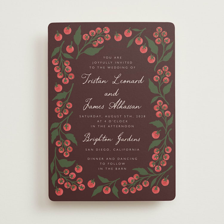
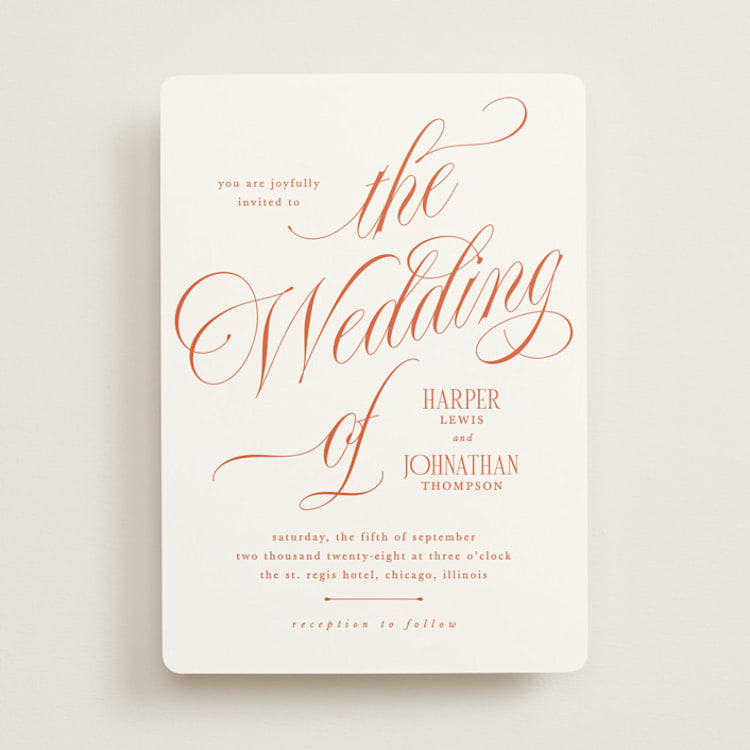
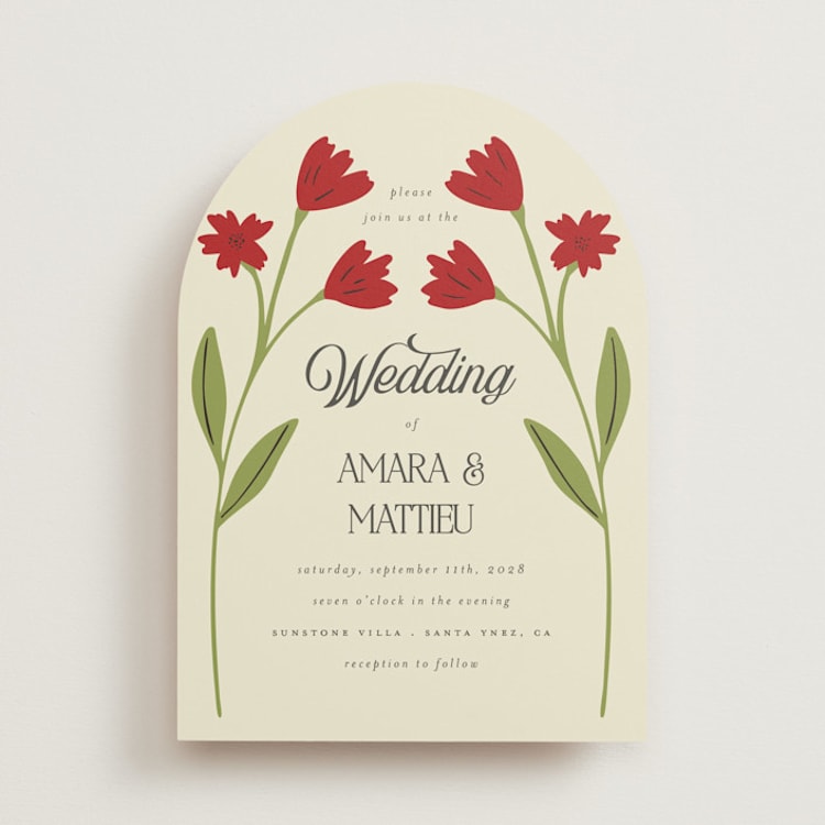
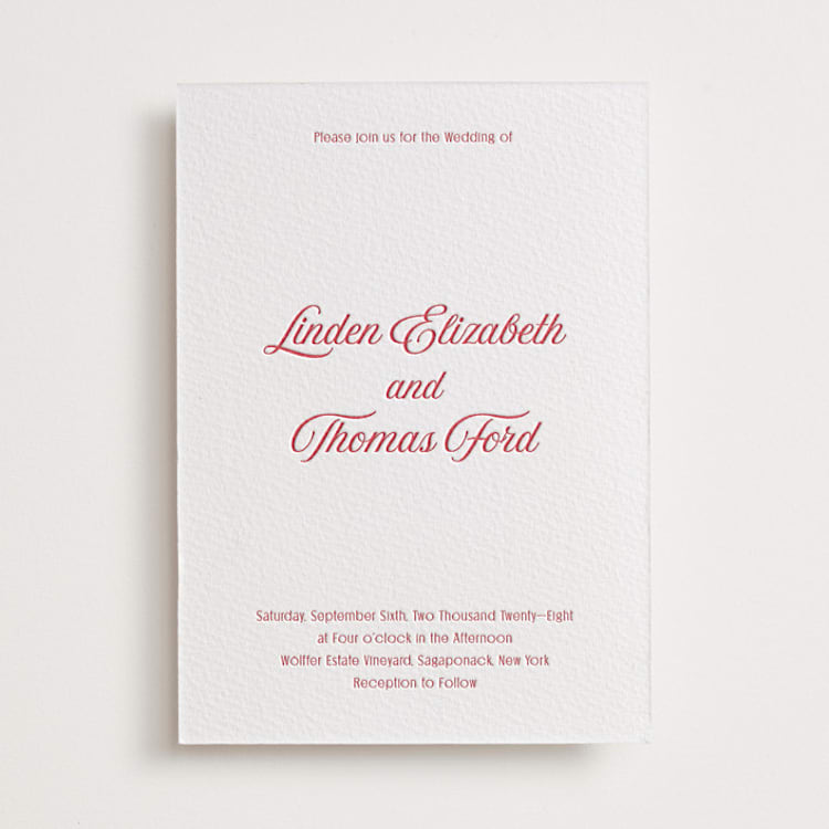
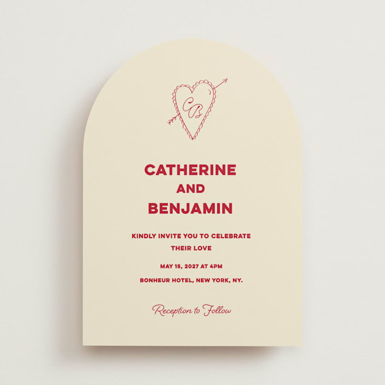
Red Wedding Invitations
Red is known as the color of extremes: passion, love, danger, and anger. Historically, its intensity has caused couples to shy away from red wedding invitations. But now, more couples than ever are taking cues from Chinese and Indian cultures — which associate red with luck, joy, and prosperity — and incorporating the color into their big day.
Trending Shades of Red for 2026
- Cherry. Rich and bright cherry red has been one of our favorite shades for a few years now, and we love how couples continue to find fun ways to incorporate it into their big days in the form of decor, bright red florals, and, of course, invitations.
- Wine. Deep wine tones are a great option for couples who like the idea of red, but don’t want to go overly vibrant with their color palette.
- Rust. Burnt, rusty shades of red have always been a go-to color to incorporate into fall weddings, but they’re also great for rustic and barn-themed celebrations.
Red Color Schemes
- Cherry Red + Cornflower Blue. Vibrant, punchy, and playful, this pairing is perfect for weddings that are going big on personality, and pairs nicely with whimsical hand-drawn design elements.
- Red + Gold. Chinese wedding invitations traditionally pair vibrant, candy-apple red with gold foil to communicate the prosperity of the marriage. This pairing also works well with wine tones for a more muted, but no less luxe, look.
- Red + Green + Cream. A botanical print in rich greens and reds is a beautiful, subtle nod to classic colors of the season when paired with cream or white for a holiday wedding.
- Rust + Wine + Yellow. Lean into the beautiful shades of fall with a wedding invitation that features a color palette of rust, wine, and rich yellow.
Themes where Red Invitations Might Make Sense
- Holiday Weddings. If you’re planning a December wedding that will incorporate a Christmas tree, holiday wreaths, and pinecones, invites with red berries and holiday branches are a natural tie-in.
- Rustic Weddings. Burnt reds come to mind when thinking about a barn wedding that features an old tractor parked out front, which makes it the perfect shade to incorporate as an accent color in invitations for a rustic wedding.
- Preppy Weddings. If you’re looking for a way to modernize classic venues like country clubs or historic estates, red is the way to do it. Incorporate it into striped and scalloped details, punchy red florals, and fun flashes of color in a bold red lip or wedding day manicure
- Chinese Weddings. Red is the most popular color in China and symbolizes luck, joy, and happiness. Perhaps one or both members of the wedding couple want to pay homage to their Chinese culture and roots by featuring the auspicious color throughout their wedding stationery.
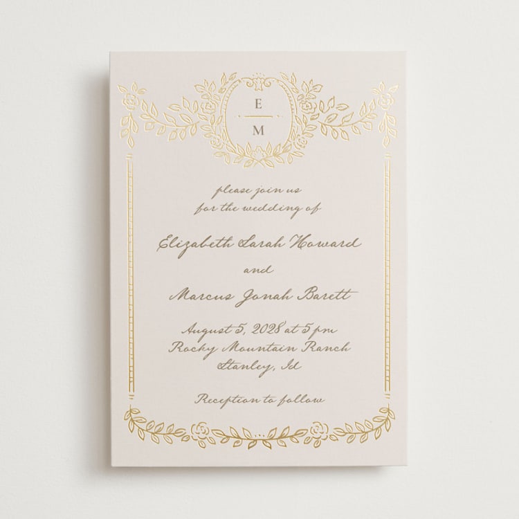
Silver or Gold Wedding Invitations
Out of all the colors on this list, silver and gold are most often thought of as accents — but they don’t have to be! Both colors are steeped in tradition and symbolism. Silver is most often associated with elegance, sophistication, and modernity — it is also thought to be a mirror to the soul, helping us see ourselves as others do, making it very fitting for a wedding celebration. Gold is associated with luxury, good fortune, royalty, and spiritual power, and many cultures have traditions of exchanging gold on wedding days to mark the prosperous start of a marriage.
Silver Color Schemes
- Silver + Stone. To play up the natural beauty of silver, go for an invitation that features it as an accent to a background in a light gray or dusty cream.
- Silver + Navy. Navy’s natural cool tone means that silver is its perfect complement. A navy and silver invitation is perfect for city weddings with a modern, luxe vibe.
- Silver + Pastels. For a fresh take on silver, look for an invitation that pairs silver foil unexpectedly with pastel blues, purples, and even corals.
Gold Color Schemes
- Gold + Black. For couples looking to balance boldness and tradition, a black and gold invitation will never go out of style. Tailor it to your taste by looking for designs that use gold foil in interesting ways, such as to create an intricate pattern or to accent playful typography.
- Gold + White. Gilding an invitation printed on white cardstock is a timeless way to communicate luxury and tradition.
- Gold + Wildflower Tones. Give an invitation that features a palette inspired by a wild bouquet of wildflowers a luxe upgrade with gold foil accents. This palette is surprisingly versatile — it can lean vintage or modern, depending on the illustration style it is paired with.
Themes where Silver or Gold Invitations Might Make Sense
- Ballroom Weddings. If your wedding celebration is an extravagant ballroom affair, bring that elegance into your wedding invitations with designs that include dramatic silver or gold foil elements.
- Garden Weddings. Juxtaposing colorful flowers with reflective gold or silver is a beautiful way to combine organic and glamorous aesthetics. There are plenty of beautiful wedding invitation designs that combine the two into miniature works of art, and you can further build on this theme with silver flower vases for your centerpieces or gold napkin rings at each place setting.
- Winter Wonderland Weddings. We often associate silver with snowflakes and ice, so carry that theme forward with beautiful silver mountain wedding invitations.
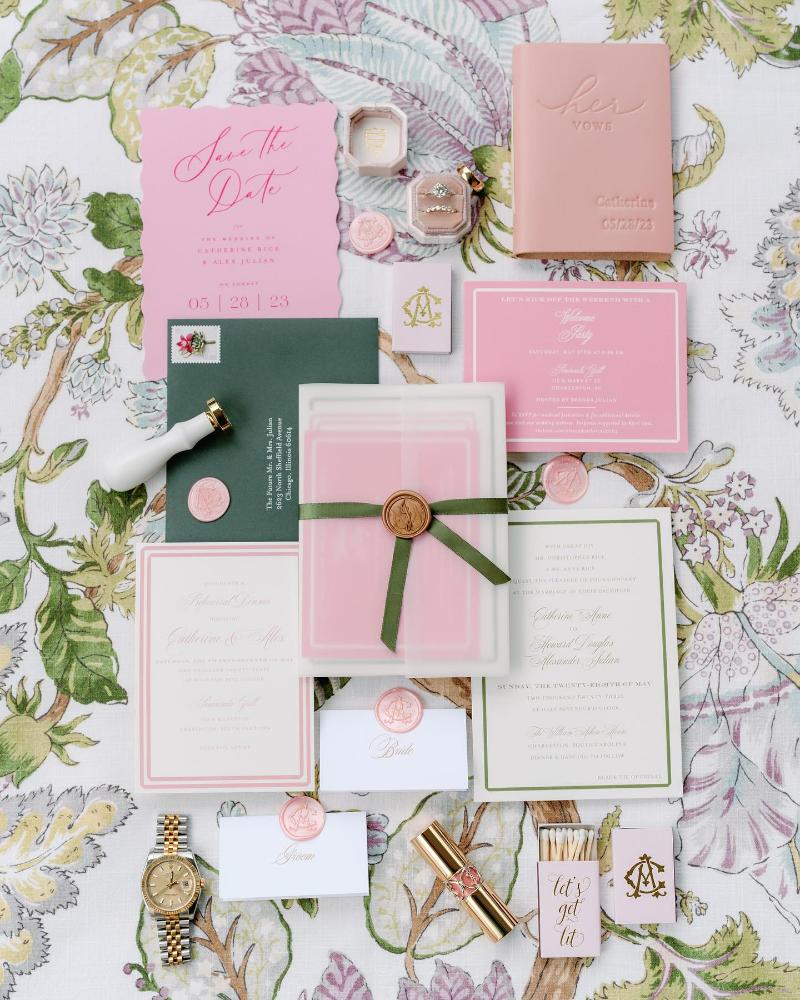
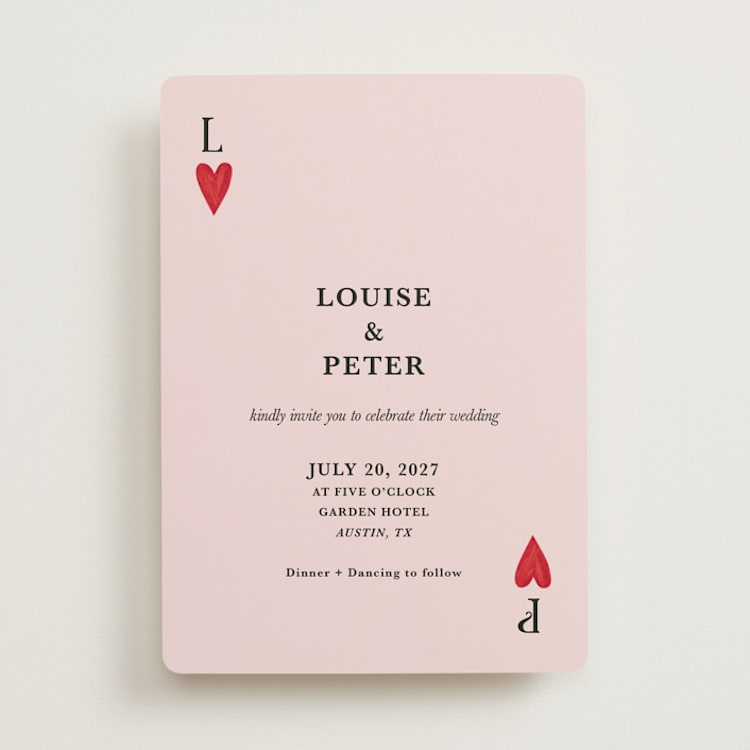
Pink Wedding Invitations
Universally, pink is recognized as a color of love, friendship, and affection, but it can also be associated with flowers, whimsy, and a general air of playfulness. A great color for a spring affair, you will have choices galore for wedding flowers in different shades of pink, red, and white.
Popular Shades of Pink for 2026
- Dusty Mauve. A desaturated mauve is a beautiful way to lean into the more mysterious side of pink, making it perfect to incorporate without coming off too feminine.
- Ballet-Slipper. Light, baby pink is a classic — and with the continuation of the balletcore trend, is a color that is only getting more popular.
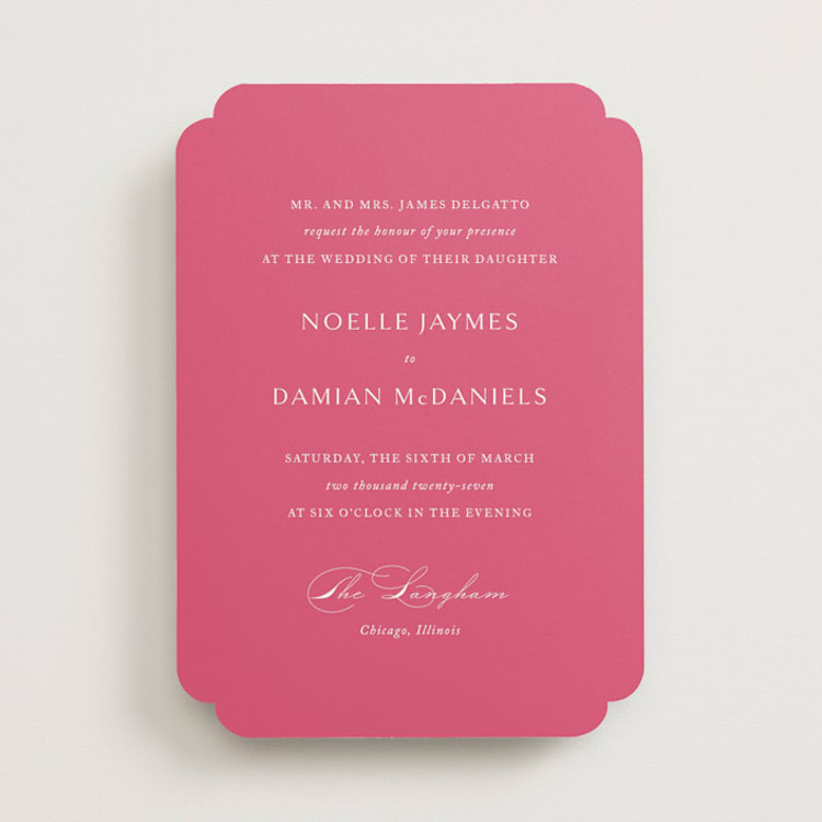
- Magenta. On the opposite end of the pink spectrum, couples have embraced hot pink and magenta as a fun and punchy accent color for both wedding decor and their invitations.
Pink Color Schemes
- Pink + Black. Both ballet-slipper pink and dusty mauve look great when paired with black. To keep a romantic vibe, look for invitations that keep pink as the predominant color or, play with contrasts by finding a design that incorporates equal amounts of the two hues.
- Ballet Pink + Copper. For a fresh twist on a foil-pressed invitation, forgo classic gold or silver for a warm, rich copper. The color is deep enough to provide a nice contrast to the lighter pink shade, while still being within the same color family for a chic tonal look.
- Magenta + Green. This color palette takes its inspiration from rich magenta flowers like bougainvillea, dahlias, and Camille Pissarro roses. Pair it with creamy background colors and lighter pinks for a softer look to your invitations, or go saturated with vivid greens and bright whites for a tropical look.
Wedding Themes That Pair Perfectly With Pink Invitations
- Poolside Weddings. We often associate bright pink with flamingo pool floaties and days by the pool sipping tropical drinks through fluorescent pink straws — or, on the more glamorous end of the spectrum, with the iconic pink and green palette of the pool at the Beverly Hills Hotel. Bring that playful color and look into your wedding invitation selection.
- Backyard Weddings. Lush pinks and shades of fuchsia come to mind when imagining backyard rose gardens or full floral centerpieces, making it an ideal color choice for a backyard wedding invite.
- Bohemian Weddings. A wide range of pinks are often used in boho chic wedding decor, so it seems only natural to pull that color palette over into your wedding signage and stationery as well.
- Easter/Spring Weddings. Pastel colors for early spring weddings are a classic for a reason. Make it more modern by pairing softer pinks with unexpected pops of saturated colors like cobalt or magenta.
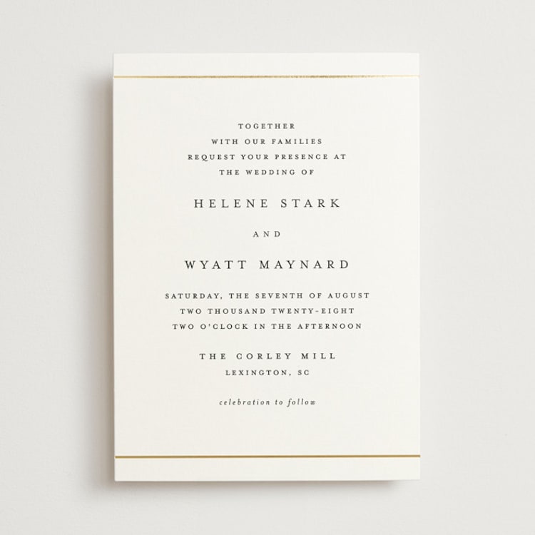
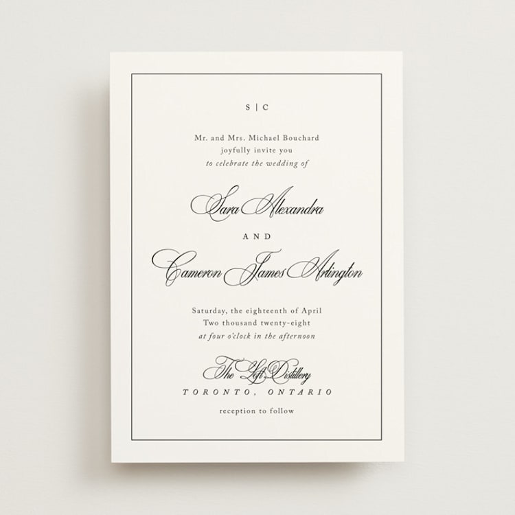
White Wedding Invitations
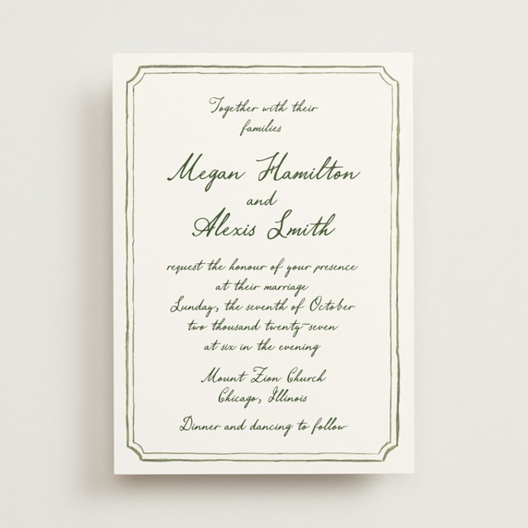
Representing innocence, purity, and new beginnings, white conveys a sense of cleanliness, freshness, and — when it comes to Western weddings – tradition. Because it is the lightest color and very easy on the eyes, it is the go-to option across a wide range of wedding aesthetics and styles. Make your stationery noteworthy by opting for a luxurious letterpress invitation suite.
White Color Schemes
- White + Black. You really can’t go wrong with this color scheme — just be sure to lean on details like letterpressed text and luxe cardstock to make invitations in this paired-back palette feel special.
- White + Cream + Green. It feels counterintuitive to combine white and cream, but when put together in an invitation design that calls to mind the beauty of creamy white flowers like magnolias or roses in all their complexity, it can be beautiful.
- White + Metallics. If you love the look of a foil-pressed invitation, going for a predominantly white design can be a great option. That way, the beautiful gilt of the foil color you choose will really pop — especially if you go for a color that is slightly deeper, like gold or copper.
Wedding Themes That Pair Perfectly With White Invitations
- Simple/Micro Weddings. For the couple that isn’t looking to max out their wedding budget and aiming to keep the guest count relatively small and intimate, a simpler white invitation might help carry that desire across to invited guests.
- White Tie Weddings. A white tie wedding is even more formal than black tie weddings, and is often synonymous with luxury and glamor. With all the white bow ties, white vests, and white waistcoats, it only seems fitting to feature pristine white wedding stationery.
- Traditional/Religious Weddings. A classic white invitation is perfect if you and your spouse-to-be want to stick to tradition or focus more on the religious significance of matrimony.
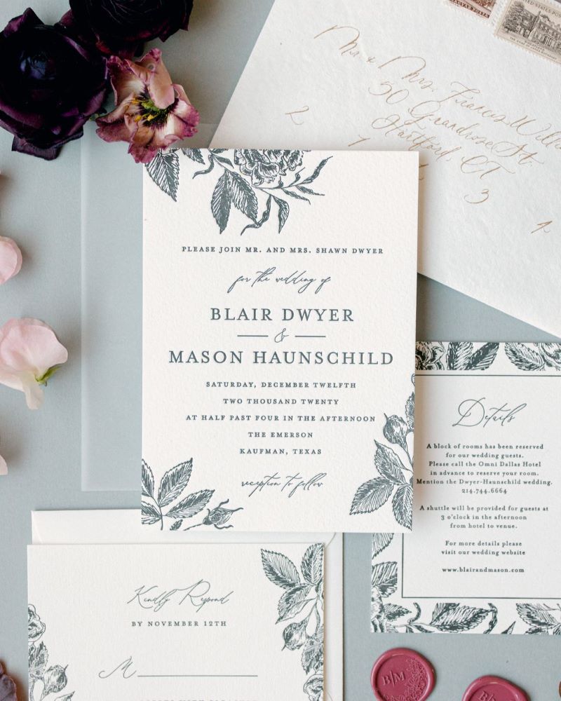
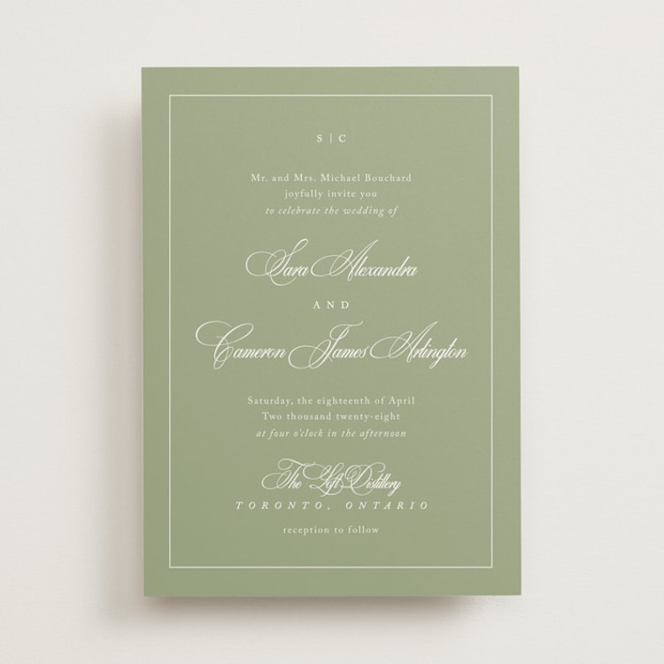
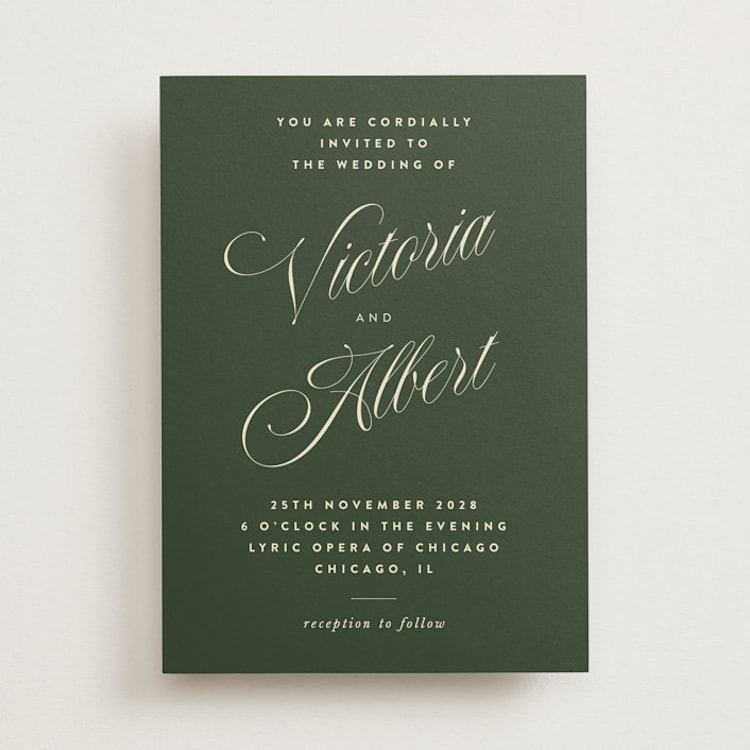
Green Wedding Invitations
The embodiment of nature, renewal, and life itself, green can be a beautiful color to incorporate into your wedding. Depending on the shade, green can almost serve as a neutral, or it can be bold and punchy. Either way, it is known to have a relaxing and harmonizing effect, which sounds like just the right atmosphere for a reunion of your closest friends and family.
Popular Shades of Green for 2026
- Tea Green. Lighter shades of green, like sage, have become wedding staples and will always be in style. But, if you’re looking for a more contemporary spin, go for a delicate shade of green inspired by green tea.
- Emerald. Rich and luxurious, emerald green is a timeless shade of green that is perfect for winter weddings or more formal affairs.
- Pistachio. This playful shade is one that we see couples incorporating more and more into their weddings, and makes for a fun, unexpected pop of color in decor and stationery.
Green Color Schemes
- Emerald Green + Gold. Emerald green and gold can come together to match a huge range of styles and wedding themes, including traditional, glamorous, and even tropical destination weddings.
- Tea Green + White + Pink. If you love the look of soft, muted florals, this palette is for you. Look for a design that pairs a white background with painterly illustrations of flowers featuring various sage tones and dusty pinks.
- Pistachio + White. This color combination is perfect for couples who want their invitation to make a statement, but are minimalists at heart. A pistachio background really allows white typography to take center stage in a way that feels fresh and modern.
- Sage + Blue. Draw from the colors of the earth and the sky with this color palette. We love it in invitation designs that take inspiration from landscape paintings, making it the perfect choice for a countryside wedding.
Wedding Themes That Pair Perfectly With Green Invitations
- Forest Weddings. Dark green is naturally associated with the woods. Build excitement around your outdoorsy wedding venue sheltered beneath giant redwoods or set amongst an aspen grove by using it for your first wedding correspondence to your guests.
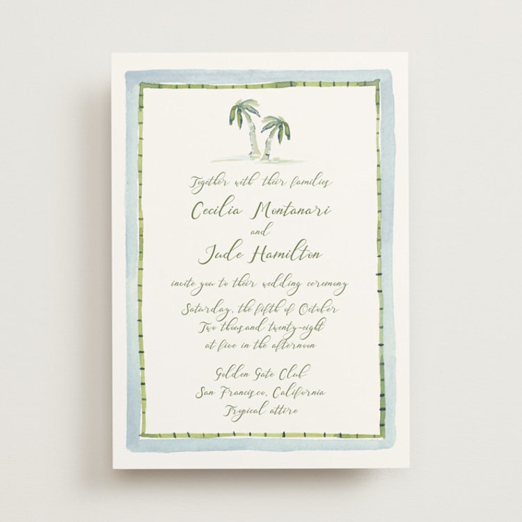
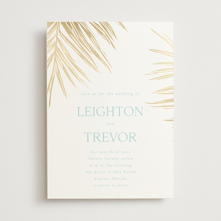
- Tropical Weddings. Palm fronds and giant monstera leaves are emblematic of an ideal tropical oasis. Get guests ready to travel to your tropical beach wedding with invites depicting the lush green plants.
- Greenhouse/Botanical Garden Weddings. If green is going to be one of the predominant colors at your wedding — as it will be if you’re getting married in a lush botanical garden or greenhouse — then use it as a neutral in your wedding invitations! Pair it with the other colors you plan to highlight in your decor or bouquet throughout the day for an invitation that feels uniquely you.
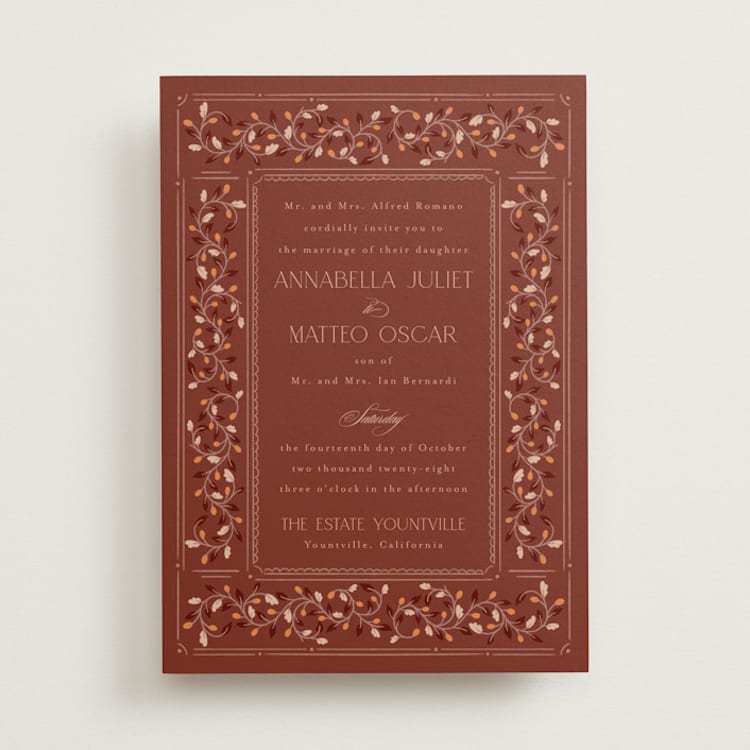
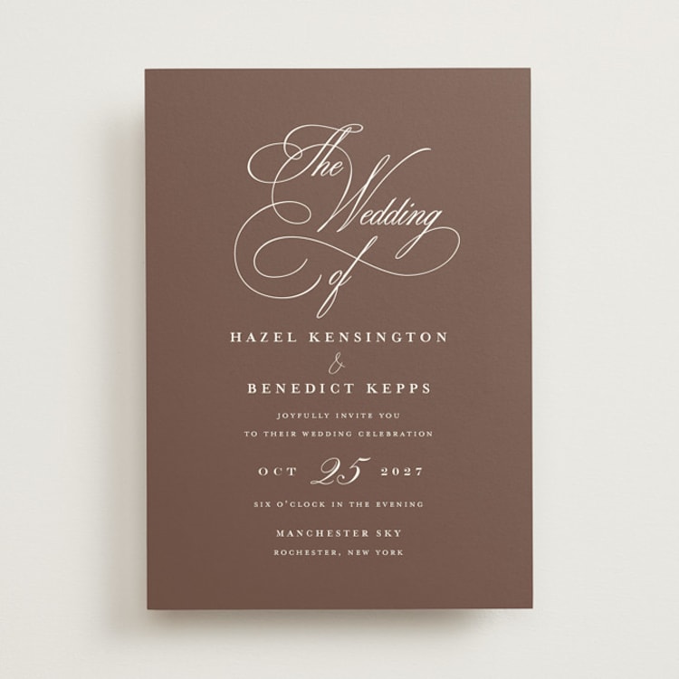
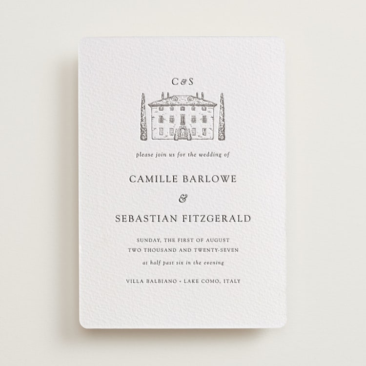
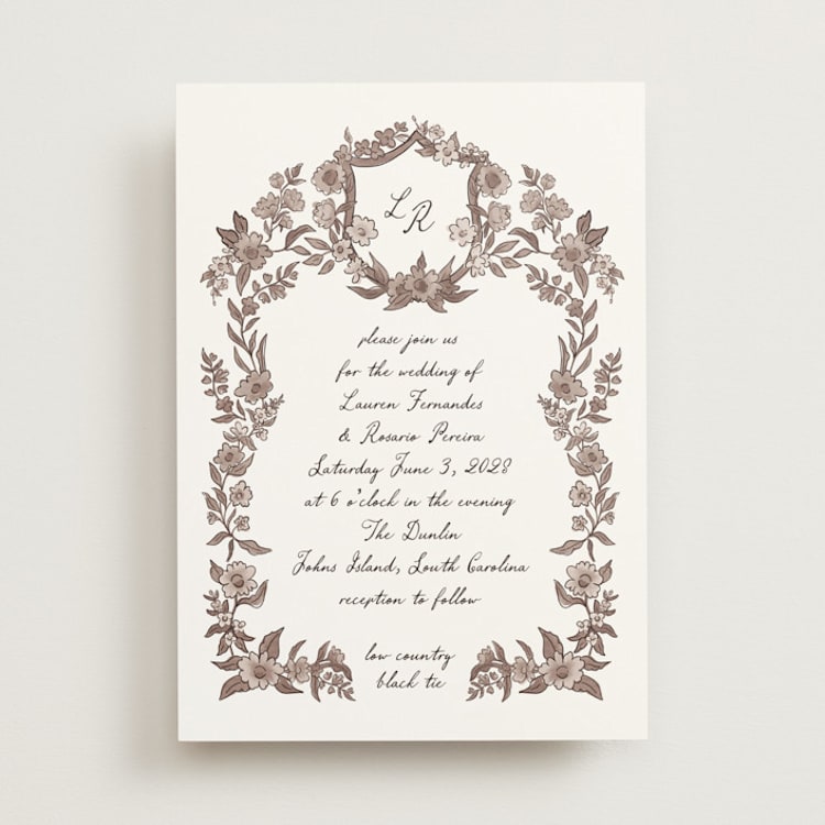
Brown and Neutral Wedding Invitations
Warm, grounding, and effortlessly sophisticated, brown and neutral tones have become a major force in wedding design. What was once considered too "safe" or "boring" is now recognized for what it really is: timeless, elegant, and incredibly versatile. These earthy shades create a sense of warmth and intimacy that feels both modern and rooted in nature.
Popular Shades of Brown and Neutrals for 2026
- Chocolate. Deep and luxurious, chocolate brown adds richness and depth to any invitation suite.
- Taupe. Sitting somewhere between gray and brown, taupe is the ultimate neutral: sophisticated without being stark.
- Sand. Warm and beachy, sandy neutrals are perfect for coastal weddings or any celebration with a relaxed, organic vibe.
- Mocha. This creamy brown shade feels cozy and inviting, making it a great choice for fall and winter weddings.
Brown and Neutral Color Schemes
- Chocolate + Gold + Ivory. Rich and luxurious, this combination brings warmth and elegance to formal celebrations.
- Taupe + Dusty Rose + White. A soft, romantic palette that feels elevated without being overly feminine.
- Sand + Navy + White. This classic coastal palette is timeless for beach weddings and waterfront celebrations.
Wedding Themes That Pair Perfectly With Brown and Neutral Invitations
- Desert Weddings. Terracotta, sand, and warm neutrals mirror the natural landscape of desert venues in places like Arizona, Joshua Tree, or Marrakech.
- Rustic or Barn Weddings. Earthy browns complement the natural wood tones found in barn venues and rustic settings.
- Minimalist Weddings. For couples who want their invitations to feel understated and sophisticated, a neutral palette lets beautiful typography and paper quality take center stage.
- Organic or Sustainable Weddings. Neutral tones pair beautifully with recycled papers and eco-friendly printing methods, reinforcing a natural, earth-conscious aesthetic.
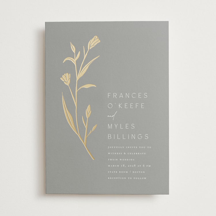
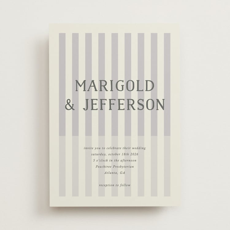
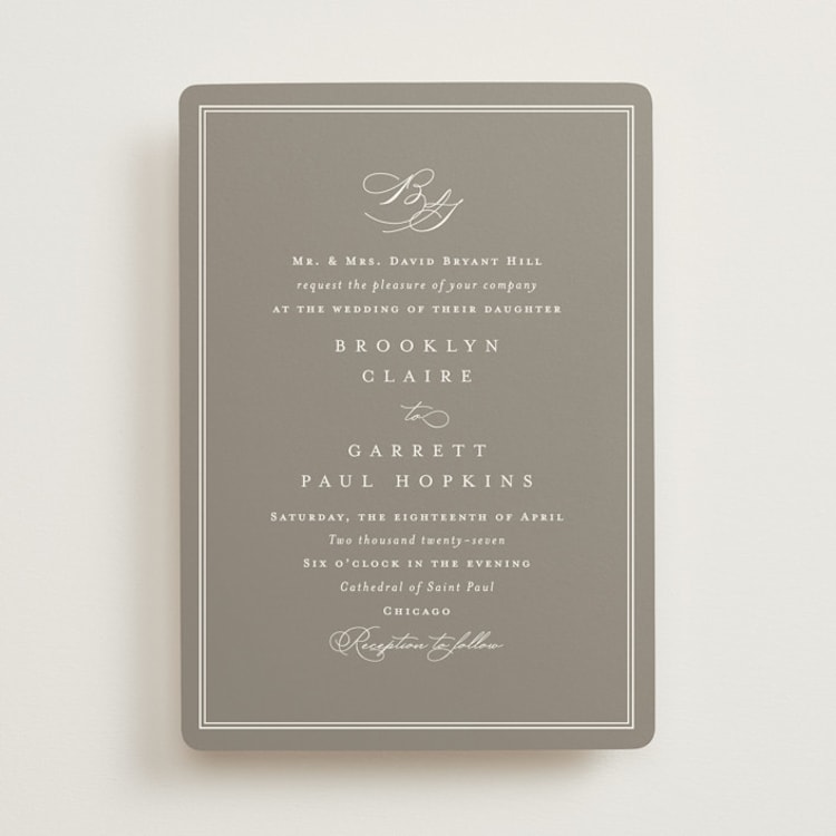
Gray Wedding Invitations
Often overlooked in favor of bolder hues, gray is one of the most sophisticated and versatile colors you can choose for your wedding invitations. It's modern without being cold, elegant without being stuffy, and pairs beautifully with almost any accent color you can imagine. This neutral powerhouse creates a refined foundation for your wedding stationery.
Popular Shades of Gray for 2026
- Dove Gray. Soft and romantic, this light gray has a gentle warmth that keeps it from feeling sterile.
- Charcoal. Deep and dramatic, charcoal offers all the sophistication of black with a slightly softer edge.
- Greige. This gray-beige hybrid is warm and inviting, making it a great alternative for couples who find pure gray too cool.
- Slate. With subtle blue undertones, slate gray feels crisp and modern — perfect for urban weddings and contemporary venues.
Gray Color Schemes
- Dove Gray + Blush + Gold. Soft and romantic, this palette is perfect for elegant weddings that want to feel warm rather than stark.
- Charcoal + White + Greenery. A modern, sophisticated palette that lets beautiful typography and botanical illustrations shine.
- Greige + Terracotta + Cream. This warm, earthy combination feels grounded and inviting — ideal for fall celebrations.
- Slate + Navy + Silver. Cool and contemporary, this palette is perfect for modern city weddings and rooftop celebrations.
Wedding Themes That Pair Perfectly With Gray Invitations
- Industrial Weddings. Gray mirrors the concrete, steel, and exposed brick found in industrial venues like lofts, warehouses, and converted factories.
- Modern Minimalist Weddings. A gray palette lets clean lines, beautiful paper, and thoughtful typography do the talking.
- Winter Weddings. Soft grays evoke the quiet beauty of overcast skies and snow-covered landscapes.
- Urban Weddings. For celebrations set against a city skyline, gray feels contextually right and effortlessly chic.
Common Color Mistakes to Avoid
Even couples with great taste can stumble when it comes to wedding invitation colors. Here are the pitfalls we see most often and how to sidestep them.
Ignoring Your Venue's Existing Palette
That bold coral you love might clash horribly with the burgundy carpet at your reception venue or compete with the exposed red brick at your ceremony site. Before locking in your invitation colors, visit your venue (or look at photos) and take note of the colors that are already there. Your palette doesn't need to match exactly, but it shouldn't fight with its surroundings either.
Chasing Trends You'll Regret
That ultra-trendy color might feel fresh and exciting right now, but wedding photos last forever. Before committing to a bold or unusual shade, ask yourself: Will I still love this in 10 years when I look at my album? Trendy accent colors are lower risk than trendy dominant colors. A pop of the "it" shade is easier to look back on fondly than an entire invitation suite drenched in it.
Forgetting About Photography
Some colors photograph beautifully. Others... don't. Neon shades can cast an unflattering color onto skin in photos. Very pale colors can wash out entirely. If flat-lay photos of your invitation suite matter to you (and they're often some of the prettiest detail shots from a wedding), consider how your colors will read on camera. When in doubt, ask your photographer for input.
Skipping the Sample Order
We cannot stress this enough: order samples. Colors on screens are approximations at best. Paper stock, printing method, and finish all affect how a color actually looks in your hands. Matte paper absorbs ink differently than glossy paper does. Letterpress creates subtle variations. Foil adds dimension that's impossible to capture on a screen. Taking a bit of extra time to order samples upfront can save you from a very expensive mistake.
And the best part? When you order from Minted, your samples don’t have to come out of your invitation budget. Learn more about our stationery and order your free sample kit here.
Overcomplicating Your Palette
More colors don't mean more beautiful. Some of the most stunning wedding invitations use just two or three colors with intention and restraint. If your palette is feeling chaotic, try removing a color rather than adding another one. Simplicity often reads as elegance.
Choosing Colors in Isolation
Your invitations are part of a larger visual ecosystem that includes save-the-dates, programs, menus, place cards, and signage. Before finalizing your invitation palette, think about how these colors will carry through your other wedding stationery. You don't need everything to match perfectly, but there should be a clear through-line.
Frequently Asked Questions About Wedding Invitation Colors
How do I choose a wedding invitation color if I haven't finalized my wedding palette yet?
Start with what you know for sure: your venue, the season, and any colors you're already committed to (like bridesmaid dresses or a family heirloom you're incorporating). From there, choose an invitation palette that feels directionally right rather than trying to nail every detail. Your invitations go out months before your wedding, so it's okay if your decor palette evolves slightly. Focus on getting the overall mood and tone right rather than an exact color match.
Should my wedding invitations match my save-the-dates?
They don't need to match exactly, but they should feel like they belong to the same family. Carrying over one or two colors, a similar design style, or the same typeface creates continuity without being repetitive. Think of your save-the-date as a teaser and your invitation as the main event.
What's the most versatile wedding invitation color?
Navy, sage green, and warm neutrals like taupe tend to work across the widest range of venues, seasons, and aesthetics. If you're feeling stuck, these are safe starting points that won't limit your decor options later. That said, "versatile" shouldn't override what actually feels like you. Sometimes the less obvious choice is the right one.
Can I use different colors for different pieces in my invitation suite?
Absolutely, and it's a smart way to add visual interest. Many couples use their dominant color on the main invitation, then introduce secondary shades on the RSVP card, enclosure cards, or envelope liner. This layered approach lets you showcase more of your palette without crowding a single piece.
How do I know if a color will print the way it looks on screen?
The short answer: you won't know until you see it in person. Screens use light to display color, while printers use ink, so there's always some translation involved. Paper finish matters too; the same color looks different on matte versus glossy stock. This is why printed samples are worth the investment before placing your full order.
What colors should I avoid for wedding invitations?
There's no universal "don't" list, but some shades require extra consideration. Very pale colors can read as unintentional or washed out. Neons rarely translate well to print. And highly saturated shades may limit your flexibility when coordinating with florals and decor. The bigger pitfall is usually overcomplicating your palette rather than choosing the wrong individual color.
Do my wedding invitations need to match my wedding colors exactly?
Not at all. Your invitations set the tone for your wedding; they don't need to be a perfect replica of your decor. Many couples feature just two or three of their wedding colors on stationery and let the full palette unfold on the day itself. Guests won't be comparing swatches; they'll simply notice whether everything feels intentional and cohesive.
Your Dream Palette, Your Way
No matter what wedding invitation idea and color scheme you’ve fallen head-over-heels in love with, know that Minted has a unique design to match your vision. All of our invitation designs come in multiple colorways hand-picked by the independent designer who created them, and are also available to be customized — meaning that you can find a shade that perfectly aligns with your wedding color palette.