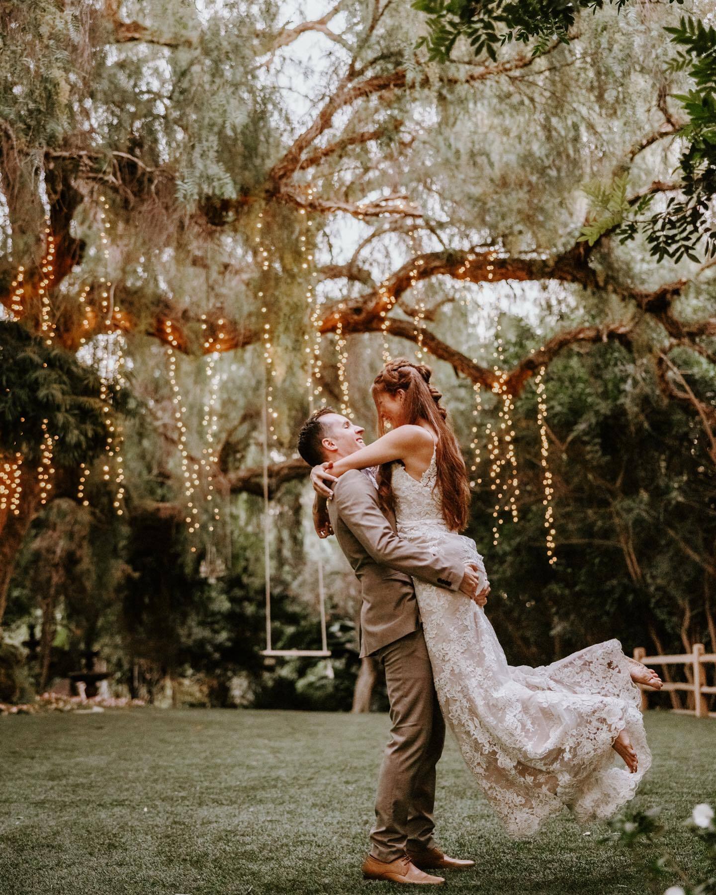

Sunny days, warm nights, vacation, and all the popsicles you can eat. What’s not to love about summer? This season is in itself a reason to celebrate, and the possibilities for a summer wedding are endless. Ideal summer wedding colors balance bold and bright with a touch of romantic softness. Whether you’re having a small backyard ceremony or a big bash at a beach resort, don’t be afraid to make a statement with your summer wedding colors, theme, decor, and more.
To guide you as you start your wedding planning, we're sharing our favorite wedding color ideas for summer, along with creative ways to incorporate those hues into your wedding details, including the invitations, floral arrangements, cocktail ideas, wedding favors, and more. From boho to vintage to rustic, keep reading for our favorite color combinations to inspire your own summertime celebration.
TOP WEDDING COLORS FOR SUMMER 2025
The wedding color trends shaping up to define this summer embrace both vibrant energy and refined sophistication. While sun-kissed hues like Verona Sunset (Minted x BRIDES color of the year!) and butter yellow capture summer's warmth, cool tones like vivid blues and turquoise offer refreshing contrast. We're seeing a particular shift toward bold, saturated colors being balanced with sophisticated neutrals like champagne and grey, allowing couples to create statements that feel both modern and timeless.
Coral: A Fresh Take on Summer Romance
Key Shades: tangerine coral, peach coral, salmon pink, warm blush coral
Coral captures the essence of summer — warm, vibrant, and full of life. This versatile hue ranges from soft peachy tones to vibrant tangerine-tinged shades, making it adaptable for any summer wedding style. What makes coral particularly special for summer celebrations is its ability to look equally stunning in bright daylight and during golden hour.
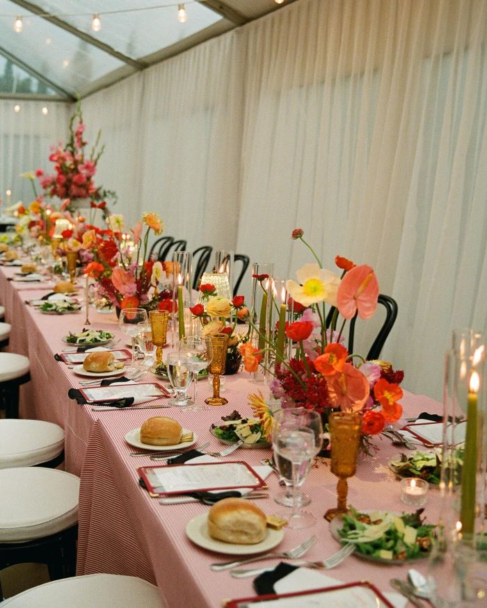
Photo by Jules Miranda
Here are our favorite ways to pair coral for different wedding styles:
- Coral + White + Turquoise: This beachy combination works well for oceanside venues, with coral representing sunset, turquoise echoing water, and white adding crispness.
- Coral + Navy + Cream: A classic choice that works in both formal ballrooms and garden venues. Navy adds sophistication, while cream softens the contrast.
- Coral + Sage + Blush: Perfect for garden or greenhouse venues, this combination feels natural and modern. Sage adds an organic element, while blush creates smooth transitions.
- Coral + Gold + Ivory: For a luxe atmosphere, this rich combination elevates coral. Gold adds warmth, while ivory creates a clean base.


Styling Tips for Coral Weddings
Bring this vibrant hue to life throughout your celebration with these creative touches:
- For Your Ceremony: Create a ceremony backdrop with coral flowers, or line your aisle with coral petals or patterned runners.
- For Your Reception: Layer your tablescape with coral candles, floral arrangements, and charger plates. Consider coral-tinted lighting for the evening ambiance.
- For Your Details: Add coral through small touches like painted escort cards, signature cocktails with coral garnishes, or geometric cake designs.
Verona Sunset: Bold Italian Romance
Key Shades: deep Verona, Aperol orange, sunset flame
Verona Sunset brings the warmth of Italian summers to life, channeling the rich orange hues of aperitivo hour and Mediterranean sunsets. This bold shade makes a confident statement while maintaining sophistication, offering a fresh alternative to traditional wedding palettes.
Create a unique atmosphere with these striking Verona Sunset combinations:
- Verona Sunset + White + Navy: A crisp, modern take that works especially well for city weddings. White keeps the palette fresh, while navy adds classic sophistication.
- Verona Sunset + Warm Beige + Chocolate Brown: This luxurious combination draws inspiration from heritage design, creating a rich palette that's perfect for upscale venues. The neutral tones ground the vibrant orange, while adding depth.
- Verona Sunset + Blush + Green: A balanced approach that pairs vibrant warmth with natural freshness. Blush softens the orange, while green adds organic contrast.
- Verona Sunset + Olive + Cream: This Mediterranean-inspired combination captures the essence of an Italian garden party. Olive adds natural balance, while cream softens the overall look.
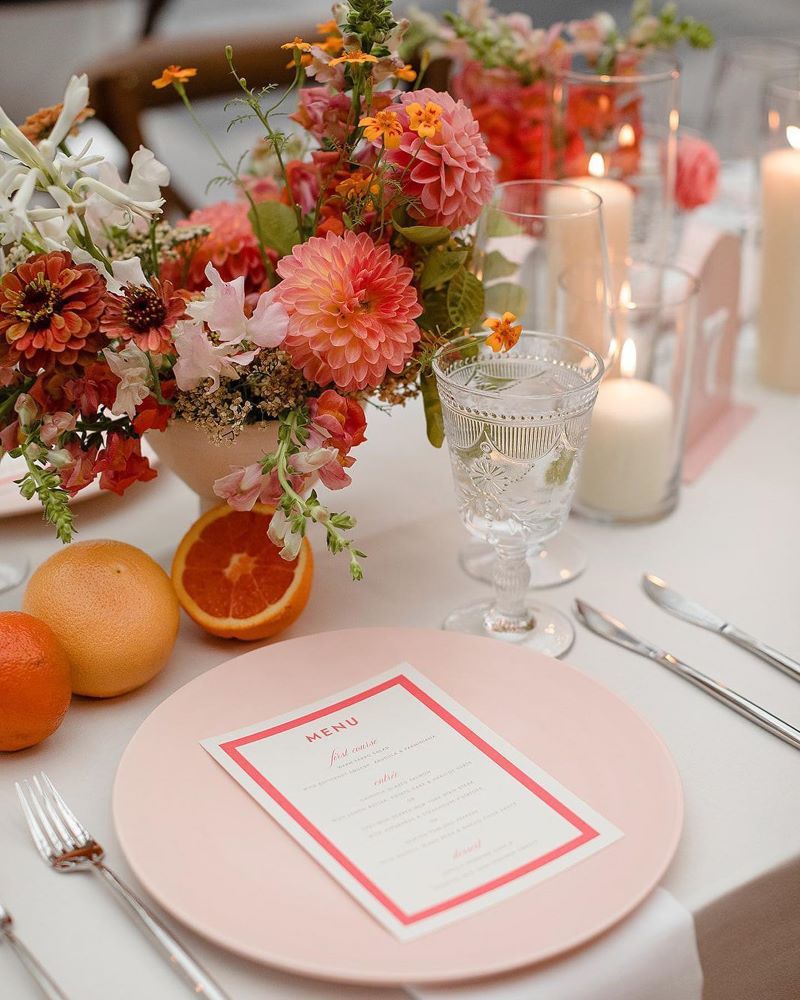
Photo by Kate Edwards Weddings
Styling Tips for Verona Sunset Weddings
Incorporate this punchy orange thoughtfully throughout your celebration:
- For Your Ceremony: Add Verona Sunset through strategic touches like aisle runners, floral arrangements, or ribbon details on ceremony chairs.
- For Your Reception: Layer the color through amber glassware, citrus centerpieces, and statement tableware. Consider sunset-inspired lighting as evening falls.
- For Your Details: Weave in Verona Sunset through the groom's accessories, invitation suites, welcome cocktails, and modern sugar flowers on your cake.


Blush Pink: Gentle Romance
Key Shades: soft blush, dusty rose, petal pink
Blush pink naturally elevates summer celebrations with its soft, romantic presence. Moving from ballet-slipper pink to deeper dusty rose, this versatile palette adapts beautifully to any wedding style. In summer light, blush creates a natural glow that enhances everything from flower petals to flowing fabric.
Create a romantic atmosphere with these blush pink combinations:
- Blush Pink + Kelly Green + Lavender: A playful, preppy combination that adds unexpected energy to summer celebrations. Kelly green brings vibrant contrast, while lavender adds a whimsical touch that keeps the palette fun and fresh.
- Blush Pink + Bright Red + Ivory: An unexpected combination that creates a modern, high-contrast look. The bright red adds dramatic energy against soft blush, as ivory balances the vibrant pairing for a fresh, fashion-forward statement.
- Blush Pink + Charcoal + Gold: Perfect for modern venues, this combination elevates blush with contemporary contrast. Charcoal adds drama, while gold brings warmth.
- Blush Pink + Ivory + Eucalyptus: This fresh, natural combination captures garden romance. Ivory provides a clean base, while eucalyptus adds subtle depth.
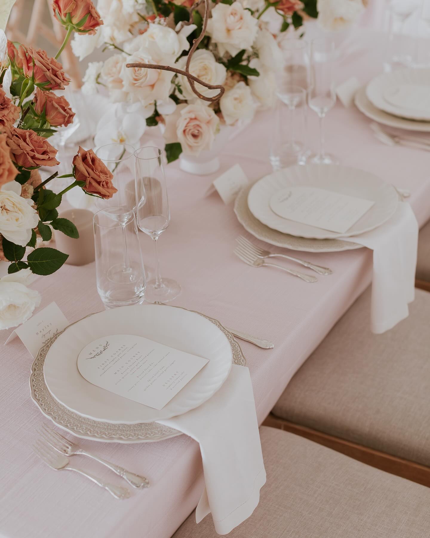
Photo by Harmonie House Images
Styling Tips for Blush Pink Weddings
Let this romantic shade enhance your celebration:
- For Your Ceremony: Layer blush through flowing fabric drapes, delicate floral arches, or ombré petal aisles that deepen from ivory to blush.
- For Your Reception: Mix blush tones in table linens, varied-height centerpieces, and textured elements like velvet napkins or matte chargers.
- For Your Details: Add blush accents through hand-dyed silk ribbons, watercolor invitation suites, or delicate sugar flowers on your cake.


Vivid Blues: Mediterranean Dreams
Key Shades: sky blue, provincial blue, navy blue
Why do blues feel so right for summer weddings? Maybe it's their ability to transition seamlessly from bright skies to evening seas. These shades bring natural sophistication to outdoor venues and create striking backdrops for indoor celebrations. During golden hour, blues take on a particularly rich quality, transforming your celebration from day to night with effortless elegance.
Create coastal elegance with these blue combinations:
- Sky Blue + White + Coral: A refreshing palette that captures seaside charm. White keeps it crisp, while coral adds warmth and energy.
- Provincial Blue + Blush Pink + Cream: Perfect for garden parties or elegant ballrooms, this combination balances depth with softness. Cream adds a polished finish.
- Navy + French Blue + White: This layered approach to blue creates sophisticated depth. White adds definition and brightness to the palette.
- Mediterranean Blue + Sand + Gold: Inspired by coastal views, this combination feels both natural and luxurious. Gold details add subtle glamour.


Styling Tips for Blue Weddings
Incorporate these cool tones thoughtfully:
- For Your Ceremony: Use blue in ceremony chairs, aisle runners, or dramatic floor-to-ceiling drapes.
- For Your Reception: Layer different blue tones through linens, glassware, and lighting. Mix in metallic accents for evening ambiance.
- For Your Details: Add blue through signature cocktails, hand-painted stationery, or subtle ribbons on bouquets.
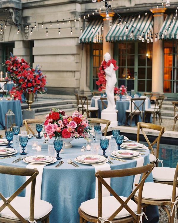
Photo by David Abel
Neutral Grey: Modern Sophistication
Key Shade: A muted, sophisticated blue-grey
Grey brings an understated confidence to summer weddings, offering a fresh alternative to traditional neutrals. This modern shade, with its subtle blue undertones, creates a sophisticated foundation that works in any setting.
Create contemporary elegance with these grey combinations:
- Neutral Grey + White + Pastel Yellow: A fresh take on neutrals that feels both modern and inviting. Yellow adds unexpected warmth, while white keeps it bright.
- Neutral Grey + Champagne + Blush: Perfect for formal affairs, this combination balances cool and warm tones. Champagne adds subtle shimmer, while blush softens the overall look.
- Neutral Grey + Sage + Ivory: This organic palette works beautifully in both indoor and outdoor settings. Sage adds natural elements, while ivory creates depth.
- Neutral Grey + Charcoal + Silver: A modern, monochromatic approach that creates subtle drama. Silver accents add sophisticated sparkle.


Styling Tips for Neutral Grey Weddings
Let this versatile neutral enhance your celebration:
- For Your Ceremony: Use grey in sleek ceremony chairs, modern backdrop installations, or elegant aisle details.
- For Your Reception: Layer different grey tones through linens, modern tableware, and architectural details. Mix textures for visual interest.
- For Your Details: Incorporate grey through modern calligraphy, minimalist cake designs, or subtle patterns in stationery.
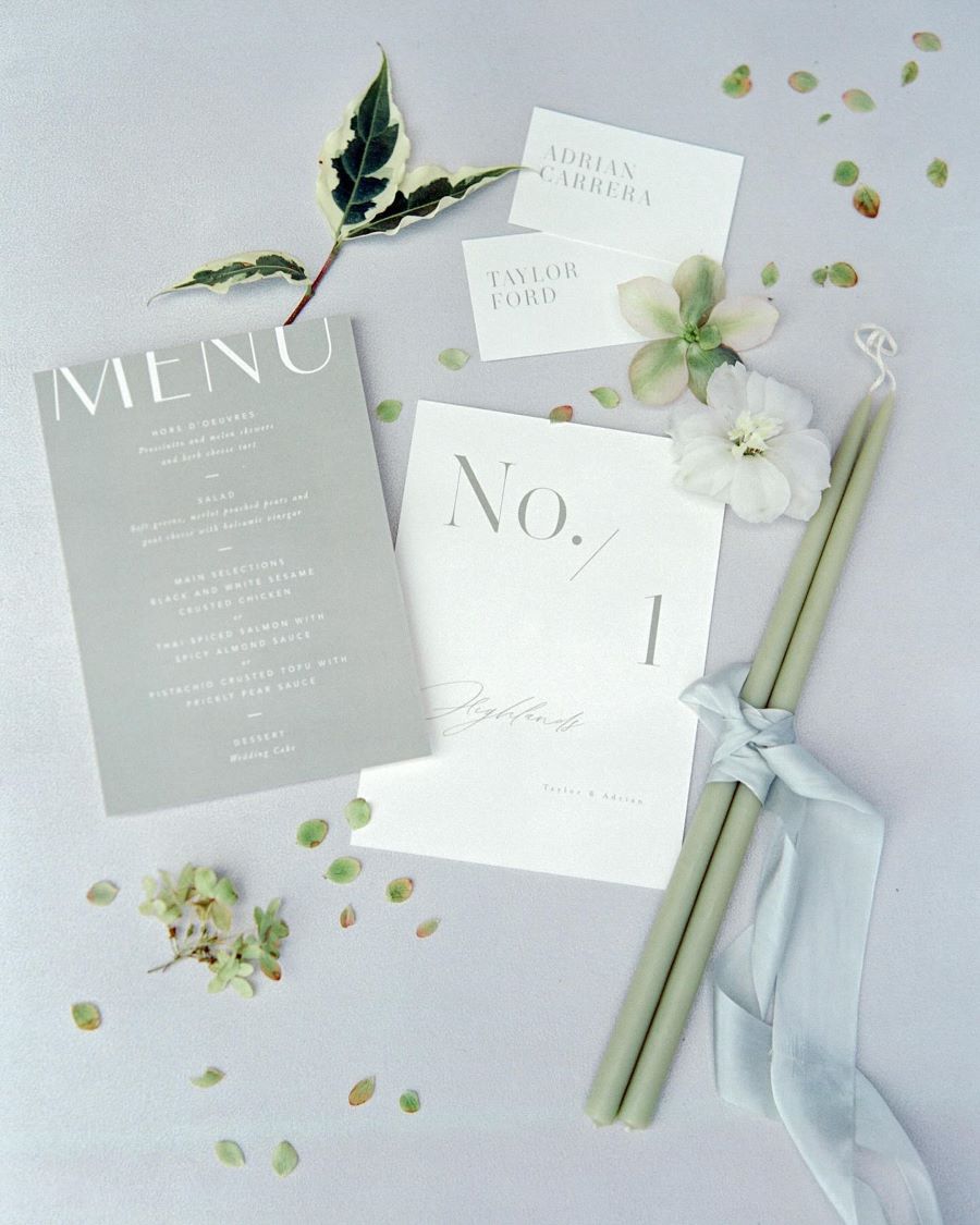
Photo by Jessica Gold Photography
Verdant Green: Natural Elegance
Key Shades: pistachio green, sage green, forest green
Looking to bring nature's beauty to your summer celebration? Green's depth and richness create that connection effortlessly. From soft pistachio to deep forest tones, this palette adapts to any venue. Outdoor spaces particularly showcase green's versatility, as natural sunlight highlights its varied undertones.
Create organic luxury with these green combinations:
- Pistachio Green + Coral + White: This fresh, playful palette works perfectly for garden parties. Coral adds warmth, while white creates balance.
- Forest Green + Champagne + Blush: An elevated combination that pairs particularly well with formal venues. Champagne adds luxury, while blush softens the richness.
- Lush Green + Moss + Olive: This monochrome approach creates unexpected sophistication, moving from the softness of moss through mid-tone olive to deeper forest accents. The result? A layered palette that brings natural elegance to both formal venues and garden celebrations.
- Matcha Green + Cobalt Blue + Lavender: This unexpected trio creates a surprisingly harmonious blend with artistic flair. The earthy matcha is grounding, while cobalt delivers bold contrast, and lavender adds a delicate touch that softens the overall effect.
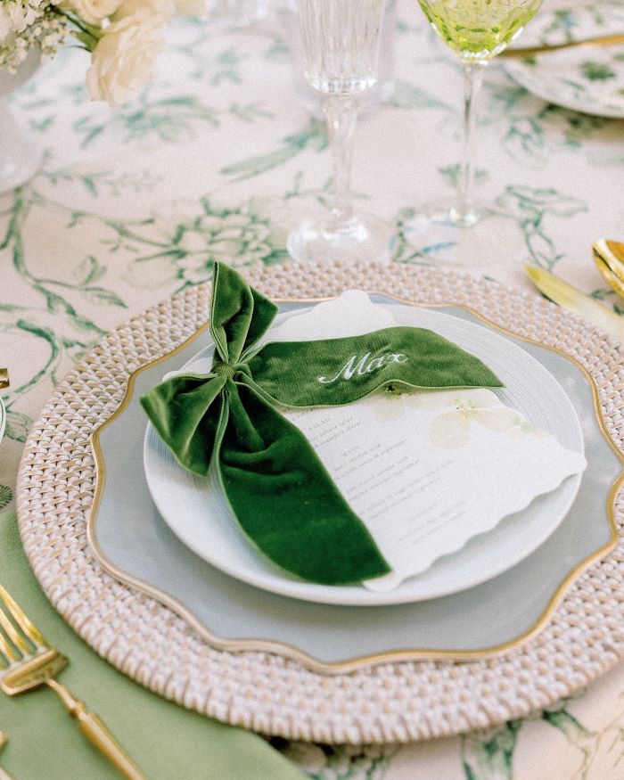
Photo by Julia Larina
Styling Tips for Green Weddings
Bring natural sophistication to your celebration:
- For Your Ceremony: Incorporate green through living walls, garden-inspired arches, or botanical aisle markers.
- For Your Reception: Layer green tones through tablescapes, velvet details, and natural foliage. Mix in metallic accents for evening drama.
- For Your Details: Add green through botanical invitation suites, emerald glassware, or fresh herb garnishes on cocktails.


Lavender: Summer Sunset Serenity
Key Shades: soft lavender, light purple, lilac
Lavender bridges the gap between subtle pastels and bold purples. This romantic shade captures twilight's gentle hues, bringing a dreamy quality to summer celebrations. Throughout your celebration, lavender moves gracefully between delicate charm and bold statements.
Create ethereal beauty with these lavender combinations:
- Lavender + Cream + Blush: A soft, romantic palette perfect for garden ceremonies. Cream adds warmth, while blush creates gentle depth.
- Lavender + Mint + Silver: This modern combination brings unexpected freshness. Silver adds sparkle, while mint provides natural balance.
- Lavender + Grey + White: Clean and contemporary, this palette works beautifully in modern venues. Grey adds sophistication, while white brightens.
- Lavender + Peach + Navy: This statement-making palette plays with both soft and bold elements. Lavender brings a dreamy quality, peach adds a fresh pop of warmth, and navy introduces dramatic depth that ties everything together. The combination works surprisingly well for both garden celebrations and more formal venues.
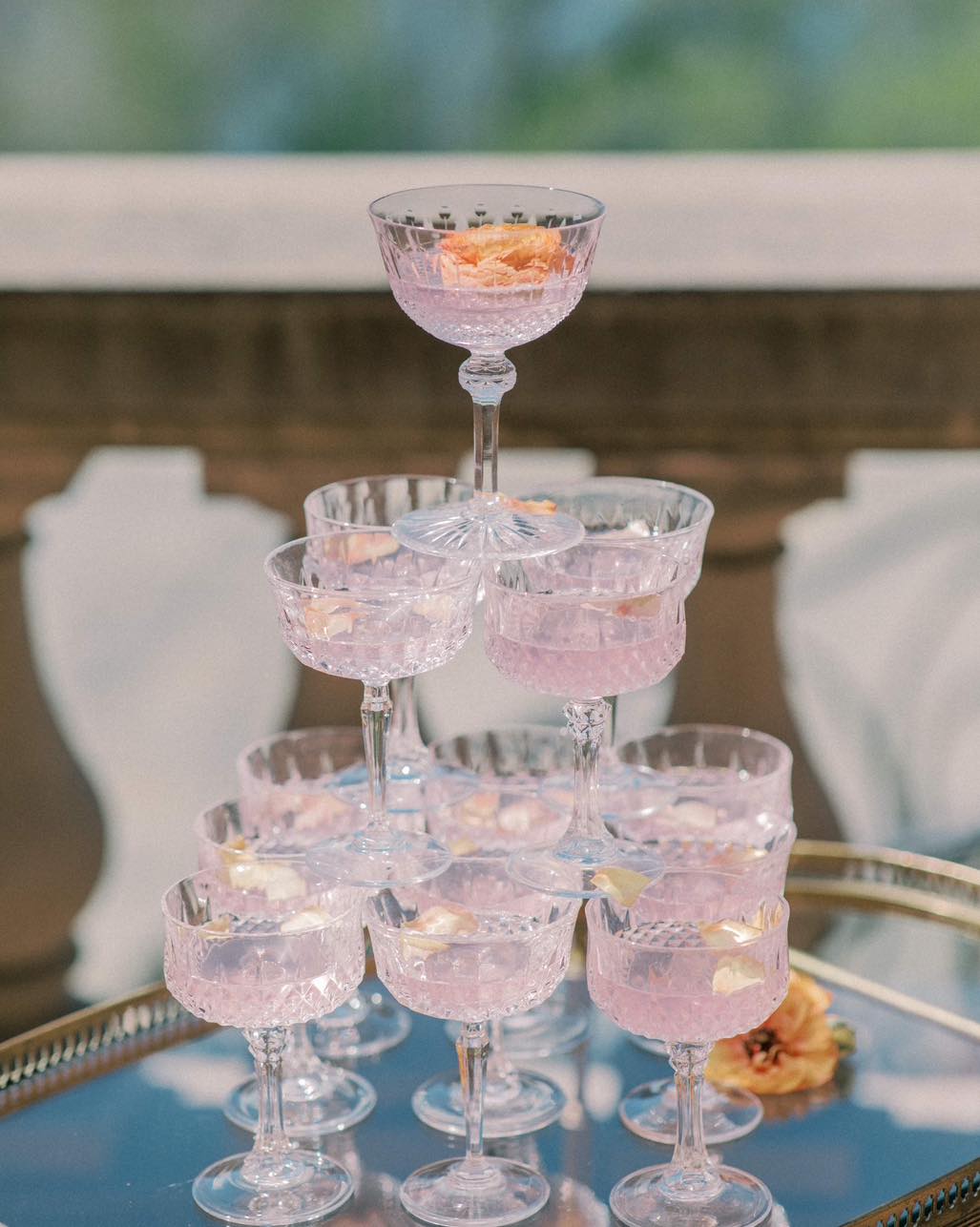
Photo by Emma J Sinclair Photography
Styling Tips for Lavender Weddings
Add romantic touches throughout your celebration:
- For Your Ceremony: Use lavender in flowing fabric installations, fresh flower arrangements, or subtle lighting effects.
- For Your Reception: Layer lavender through table linens, mixed-height centerpieces, and ambient lighting.
- For Your Details: Incorporate lavender in watercolor invitations, signature cocktails, or delicate sugar flowers.


Champagne: Timeless Luxury
Key Shades: soft champagne, warm ivory, light gold
What better color to toast your celebration? Like its namesake, champagne brings effortless elegance to summer weddings. Neither too bold nor too subtle, champagne's warm glow brings quiet luxury to every element of your celebration
Create refined elegance with these combinations:
- Champagne + Pastel Yellow + Blush: A light, luxurious palette that feels fresh and sophisticated. Yellow adds warmth, while blush brings soft contrast.
- Champagne + Sage + White: Perfect for garden ceremonies, this combination feels naturally elegant. Sage adds organic beauty, while white keeps it crisp.
- Champagne + Dusty Blue + Cream: This refined palette works beautifully in both modern and traditional venues. Dusty blue adds depth, while cream softens.
- Champagne + Bronze + Ivory: A rich combination that creates subtle drama. Bronze adds vintage warmth, while ivory brightens.


Styling Tips for Champagne Weddings
Layer this luxe neutral throughout your celebration:
- For Your Ceremony: Incorporate champagne through silk drapery, metallic details, or subtle shimmer in floral arrangements.
- For Your Reception: Mix champagne tones in linens, place settings, and candlelight. Add metallic accents for evening ambiance.
- For Your Details: Weave in champagne through foiled stationery, shimmer-dusted cake details, or pearl-toned accessories.
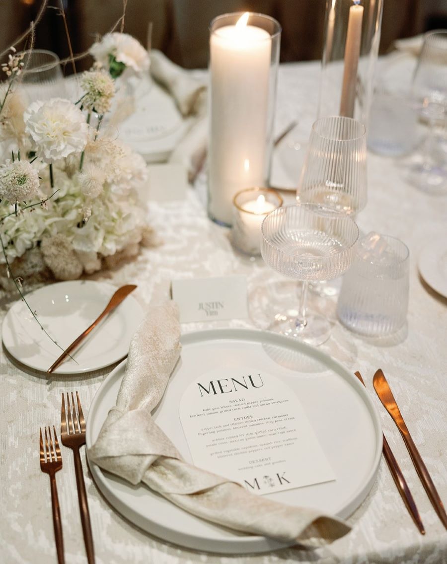
Photo by The Shepards Photo
Turquoise: Coastal Vibrancy
Key Shades: bright turquoise, aqua, teal
When ocean meets sky, they create the perfect summer color story: turquoise. From bright aqua to deep teal, this dynamic color brings energy and movement to any celebration. Its natural vibrancy enlivens both indoor and outdoor spaces, creating an atmosphere of endless summer.
Create seaside magic with these turquoise combinations:
- Turquoise + Warm Taupe + Ivory: A sophisticated spin on beach tones that works beautifully in both modern and traditional venues. Taupe grounds the bright blue, while ivory adds lightness.
- Turquoise + Navy + Blush: This sophisticated take works beautifully for both beach and city venues. Navy adds depth, while blush softens the blues.
- Turquoise + Sand + Gold: Perfect for oceanside celebrations, this combination feels naturally luxurious. Gold adds subtle glamour.
- Turquoise + Mint + Silver: A fresh, modern palette that creates cool sophistication. Silver adds sparkle, while mint provides gentle contrast.


Styling Tips for Turquoise Weddings
Bring refreshing touches to your celebration:
- For Your Ceremony: Add turquoise through ombré fabric installations, painted signage, or glass vessel arrangements.
- For Your Reception: Layer turquoise in glassware, table linens, and lighting effects. Mix in metallic accents for evening ambiance.
- For Your Details: Include turquoise in watercolor invitations, signature cocktails, or modern cake designs.
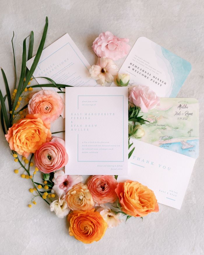
Photo by Anna Delores Photography
Butter Yellow: Summer Warmth
Key Shades: creamy butter, golden butter, buttermilk hue
Want to capture summer's glow without its glare? Butter yellow offers the perfect balance. This gentle shade creates a welcoming atmosphere that feels both fresh and familiar. Its warm undertones bring natural optimism to every moment of your celebration.
Create sunny sophistication with these butter-yellow combinations:
- Butter Yellow + Neutral Grey + White: A modern approach that feels fresh and sophisticated. Grey adds a contemporary edge, while white brightens.
- Butter Yellow + Olive + Lavender: This unexpected combination creates a gentle contrast. Olive grounds the palette, while lavender adds romance.
- Butter Yellow + Cream + Sage: Perfect for garden parties, this natural palette feels effortlessly elegant. Sage adds organic beauty.
- Butter Yellow + Navy + White: A crisp combination that works in any venue. Navy adds definition, while white keeps it fresh.


Styling Tips for Butter Yellow Weddings
Infuse warmth throughout your celebration:
- For Your Ceremony: Use butter yellow in floral arrangements, ribbon details, or subtle lighting effects.
- For Your Reception: Layer yellow tones through linens, centerpieces, and gentle ambient lighting.
- For Your Details: Add yellow through hand-painted elements, citrus accents, or delicate pattern work in stationery.
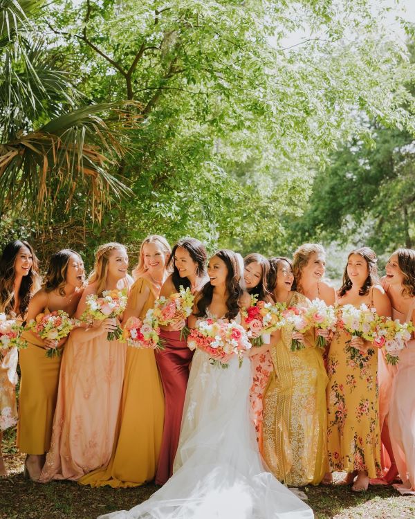
Photo by Lunalee Photography
How to Choose Your Summer Wedding Colors
With so many stunning summer wedding colors and endless combination possibilities, finding your perfect palette can feel overwhelming. Here's how to narrow down your choices:
Consider Your Venue
Let your venue guide your color choices. A garden setting naturally complements softer hues like blush and sage, while a modern city venue might call for bolder choices like Verona Sunset or deep turquoise. Beach venues work beautifully with ocean-inspired blues and sandy neutrals, while barn venues pair perfectly with rich greens and warm champagne tones.
Think About the Time of The Day
Your wedding's timing can influence how colors appear. Morning celebrations shine with lighter shades like butter yellow and soft lavender, while evening receptions can handle deeper, more dramatic tones. Remember that bright sunlight intensifies colors, while evening light softens them. Consider how your chosen palette will translate from your afternoon ceremony to your evening reception.
Factor in Your Wedding Style
Your wedding style should inform your color choices. Planning a modern minimalist celebration? Consider sophisticated neutrals with one bold accent color. Dreaming of romantic garden vibes? Layer multiple shades within the same color family. For traditional elegance, classic color combinations with metallic accents work beautifully. Let your personal style guide you toward colors that feel authentic to your vision.
Color Coordination Checklist
Once you've finalized your wedding colors, it's time to consider how they'll flow through every element of your celebration. Here's your complete guide to bringing your palette to life:
Attire and Accessories
- Bridesmaid dresses and groomsmen suits
- Ties, pocket squares, and bow ties
- Bridal accessories and jewelry
- Shoes and handbags
- Getting-ready robes
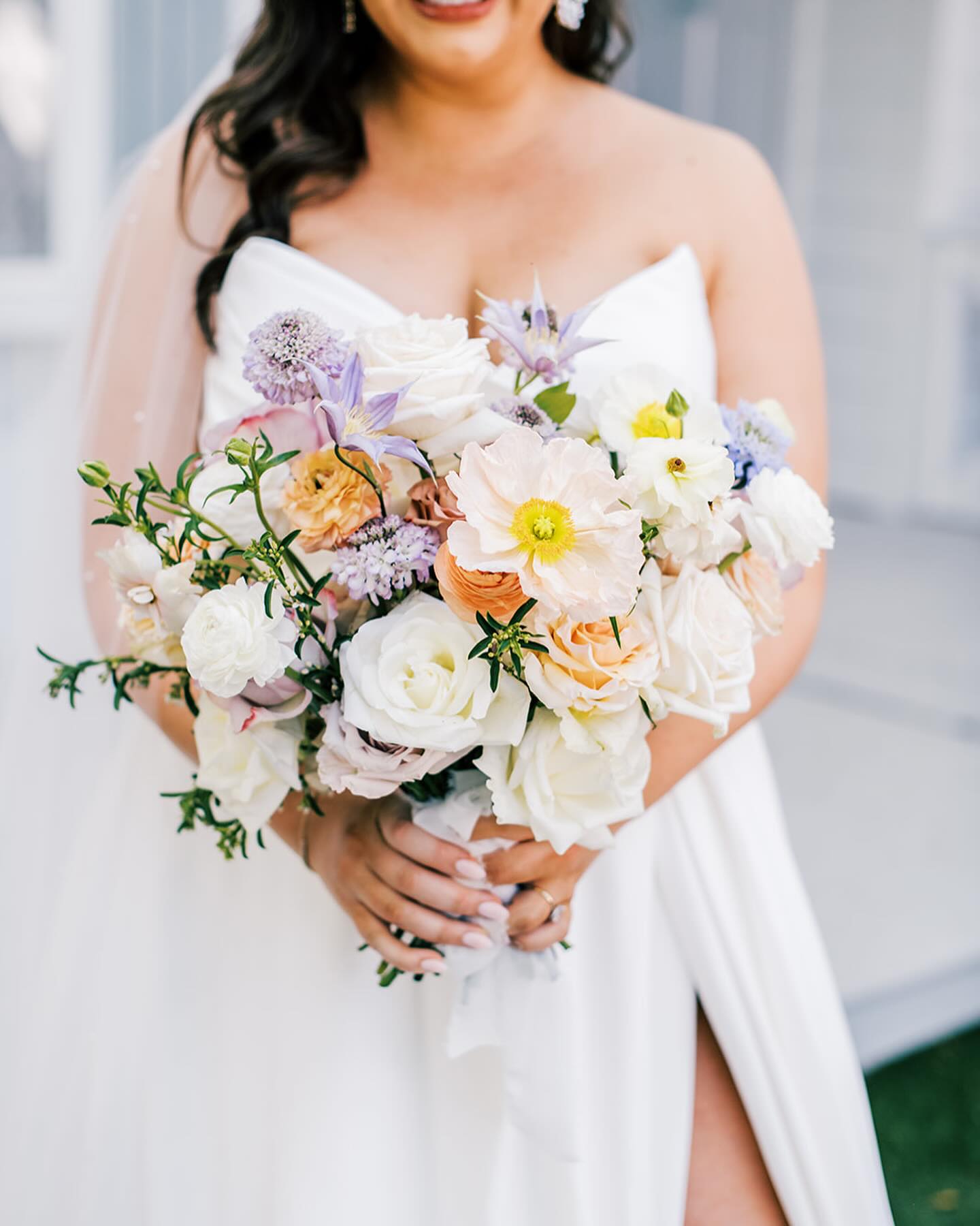
Photo by Katy Grant Photo
Flowers and Decor
- Ceremony backdrop or arch
- Bouquets and boutonnieres
- Centerpieces and table arrangements
- Aisle decorations
- Welcome signs and seating charts
- Lounge furniture and pillows
Stationery Suite
- Save the dates
- Invitations and RSVP cards
- Ceremony programs
- Menu cards
- Place cards and escort cards
- Thank you notes
Linens and Tableware
- Table linens and napkins
- Chair covers or ribbons
- Charger plates and dinnerware
- Glassware and flatware
- Table runners and overlays
Lighting
- Uplighting
- Candles and votives
- String lights and lanterns
- Neon signs
- Spotlights
Cake and Desserts
- Wedding cake design and flowers
- Frosting and fondant colors
- Dessert table displays
- Macarons and cookies
- Cocktail garnishes
Favors and Packaging
- Favor boxes or bags
- Welcome bag designs
- Gift tags and ribbons
- Custom packaging
- Take-home containers
Common Questions About Summer Wedding Colors
Planning your wedding palette can bring up plenty of questions. Here are expert answers to the most common ones we hear from couples:
How many colors should I include in my wedding palette?
We recommend selecting 2-3 main colors and 1-2 accent colors. This gives you enough variety for interest, while maintaining a cohesive look. Think of it as one dominant color, one supporting color, and one metallic or neutral to tie everything together.
How can I incorporate my wedding colors without overwhelming the space?
Follow the 60-30-10 rule: use your dominant color for 60% of the space, your secondary color for 30%, and your accent color for 10%. This creates balance, while preventing any one color from dominating.
Should my bridesmaids' dresses match exactly or complement each other?
Both approaches can work beautifully. For a modern take, consider choosing a color family (like "dusty blue") and letting bridesmaids select different shades within that palette. If you prefer a more traditional look, matching dresses create a classic, unified appearance.
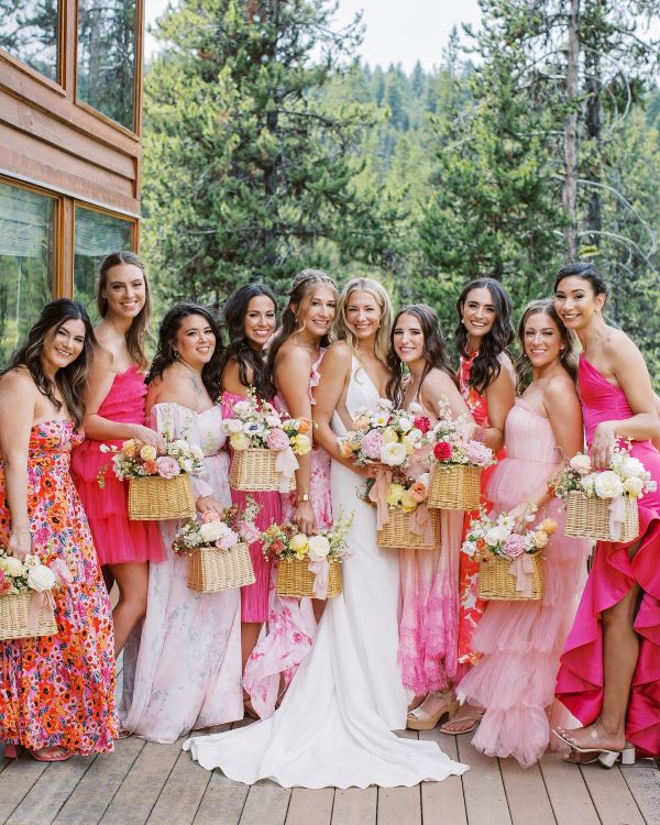
Photo by Anna Pervertaylo Photography
What colors photograph best outdoors in summer lighting?
Soft, medium-toned colors typically photograph beautifully in summer light. Pale pastels can wash out in bright sunlight, while very dark colors can look harsh. Blues, greens, and warm neutrals tend to photograph consistently well throughout the day.
How do I balance trendy colors with classic ones?
Pair trending colors with timeless neutrals. For example, if you love this season's Verona Sunset, balance it with classic ivory or champagne. This way, your photos will feel both current and timeless.
Can I use dark colors for a summer wedding?
Absolutely! Dark colors can create beautiful contrast and sophistication. The key is balancing them with lighter tones and using them strategically — perhaps in your tableware or evening reception details rather than ceremony decor.
Start Your Color Story
The perfect summer wedding starts with colors that capture the season's magic — from refreshing ocean blues to warm sunset oranges. Whether you're planning a garden party or beach celebration, your color story sets the tone for an unforgettable day. Start by exploring Minted's collection of wedding invitations to find designs that bring your summer palette to life.