

There's nothing like a spring wedding: It’s a fresh, bright, and inspiring celebration of love and a new life together. From showers (and even snow!) to sunshine, spring is a season of change — which, while it can cause headaches for planning a wedding (to invest in a tent or to not!), means that couples are spoiled for choice when it comes to picking with a color palette that is in step with the season.
But don’t worry, the experts at Minted have your back. Read on for tips and tricks to help you identify a spring wedding theme, make the most of your wedding venue, use the date of your wedding to your advantage, and zero in on the perfect spring wedding color palette for your perfect day.
Expert Tips & Tricks for Choosing the Right Spring Wedding Colors for Your Celebration
Before we get into our favorite color palettes for spring weddings, allow us to give you a helpful framework for choosing the right palette for you — because when you have options this good, it can be hard to commit! Here are our top tips for homing in on the right color palette for your big day.
Pick a Wedding Theme & Go from There
First things first: Make sure that your wedding has a theme that will tie all the details and decorations together. Your spring wedding theme can be as simple or as complicated as you want. Some couples choose a theme that’s basically just a color palette and an overall wedding aesthetic they'd like to convey — formal, bohemian, romantic, rustic, etc. Some couples go all-out with elaborate themes that get incorporated into every single aspect of the day, from hair and makeup to the playlist bumping in the limo as they escape from their reception and into their happily-ever-after. Once you decide the overall theme of your big day, a color palette will usually fall naturally into place.
Let Your Wedding Tell a Story
A wedding that’s truly memorable tells the story of the couple and community. When you're deciding on a theme to inform your spring wedding color palette, consider including some element that reflects your unique love story.
For example, if you met in Paris or plan to go there on your honeymoon, you might choose Paris as your theme and decorate with colors that reflect the city: think muted, neutral colors like rose, slate gray, and ivory — and maybe add a pop of deep red or french blue if a vintage vibe is your style. Or maybe you both enjoy old movies, in which case a black-and-white color scheme might be just the thing. Again, a bright red accent can work nicely here, or maybe a soft dusty rose — both are romantic, classic, and will lend your spring wedding colors a touch of effortless glamor that will entice your guests.
Get Inspired by Your Venue
Try to draw your color inspiration from the wedding space itself — if your venue is landscaped with daffodils, for example, choose colors that go nicely with yellow (purples, bold greens, etc.). If you decide to go with an indoor venue such as an art gallery or hotel, look for a space that includes paintings that feel like spring, whether they’re actual florals or simply paintings that incorporate some bright and light colors.
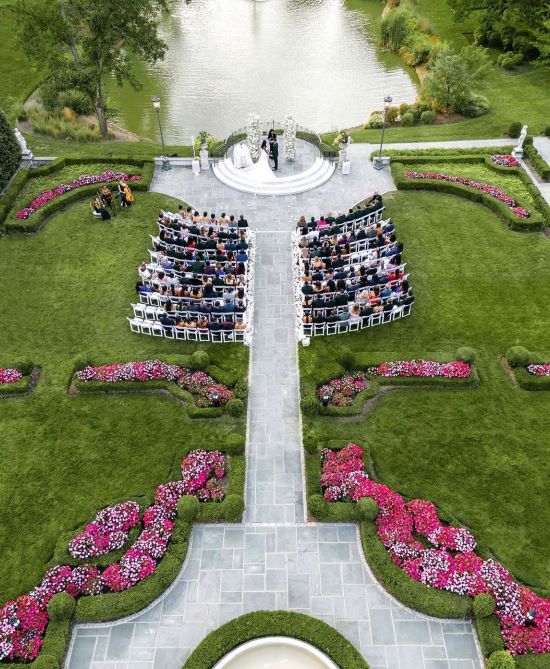
Photo by Andrii Bondarets
Best Spring Wedding Color Palettes
1. Peach, Magenta, Coral, & White
Venues: Gardens, Ballrooms, Private Estates
This playful palette is one that we predict to be trending all year, but works especially well for springtime nuptials. There are plenty of ways to incorporate these cheerful, romantic colors into the details of your big day — from showstopping florals to punchy table linens and mix-and-match bridesmaids dresses.
Photo by Emily and Luke Photography
2. Turquoise, Melon, & Navy
Venues: Garden, Ballroom, Museum, Greenhouse
The key to getting this palette right is to pick shades of turquoise and melon that are slightly desaturated — this will keep them from competing with each other and will lend a vintage flair to your big day that is at once sweet and sophisticated. We love the idea of pairing this palette with embroidered details for guests to take home as favors.

3. Lavender, Marigold, & Olive Green
Venues: Ballroom, Garden, Museum
Lavender doesn’t have to come across as overly feminine — and this palette proves it. Bright orangey-yellow marigold will really pop against more muted shades of lavender, khaki, and olive green. Decorate tables with taupe tablecloths and lavender or olive napkins, and then go wild with a mix of cheerful yellow flowers to create the perfect balance.
Photo by Caitlin O'Reilly Photography
4. Marseille Blue, Rose, Olive Green & Red
Venues: Ballrooms, Restaurants, Libraries, Museums
Don’t feel the need to limit yourself to pretty pastels when it comes to picking out your spring wedding colors! A rich, moody mix of deep blues and bold reds, tempered by on-season rose tones will create a beautiful backdrop for a glamorous wedding day.

5. Cornflower Blue, Grass Green & Cream
Venues: Churches, Barns, Country Clubs, Gardens
This palette is a springtime classic for a reason: it is versatile, sweet, and just traditional enough to work for most couples. We love putting a slightly western, retro-spin on it by opting for shades that are slightly desaturated, which — when paired with details inspired by the '60s, ‘70s, or even ‘80s, — can help your guests feel like they’ve stepped into a vintage film photograph.
Photo by Ver The Makers
6. Lime Green, Cream & Espresso
Venues: Botanical Gardens, Hotels, Ballrooms, Museums
For a thoroughly modern — and delightfully unexpected — spring wedding color palette, go with this cheerful combination. Set to be one of the biggest colors of the year, lime green makes an impact even when used in small doses (so don’t be intimidated!). Think accents on stationery and signage, napkins at your reception, and ribbons tied around bouquets.

7. Black, Cream, Kelly Green, Butter Yellow, & Dusk Blue
Venues: Ballrooms, Outdoor Tents, Gardens
Think of this palette as a springtime twist on the traditional white wedding, perfect for black-tie or even white-tie affairs. To keep things feeling sophisticated, stick to classic white (or cream) linens and place settings, and incorporate the remaining colors as accents — think tulips with vibrant green stems paired with roses in a barely-there yellow hue and dusk trim on napkins or as your something blue.
Photo by Katie Mangold Photography
8. Muted Peach, Mauve, Sienna & Taupe
Venues: Desert, Garden, Ranch
Though more colorful weddings came back into style a few years ago — and are a trend we expect to continue over the next few years — couples with a more neutral aesthetic don’t need to feel left behind! For an updated take on the neutral wedding trend, opt for a palette of tonal, warm colors that are so desaturated that they almost appear neutral. We love doing this with warm pinks and oranges to create a soft, romantic atmosphere at desert, garden, and ranch weddings.

9. Pistachio, White, & Mauve
Venues: Library, Ballroom, Museum, Estate
This palette feels very Bridgerton-inspired — making it perfect for more opulent and architecturally rich venues like historic buildings or private estates. We love the idea of using pistachio as the focal point of the decor by incorporating it into table linens and bridal party outfits (and the walls of your venue, if you’re really lucky!). Then, use white, mauve, and gold as supporting players.
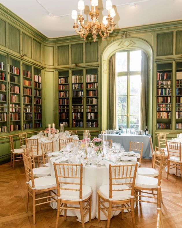
Photo by Kim Branagan
10. Dusk, Sage, & Taupe
Venues: Botanical Garden, Mountain Resort, Lake
Inspired by rainy spring evenings, this moody palette is perfect for a March or early April wedding. Incorporate the muted tones into decor like tapered candles, table linens, and florals — and then inject a bit of extra drama with pops of midnight and glittering gold.

11. Hunter Green, Bubblegum, & Rose Gold
Venues: Botanical Garden, Chic Hotel, Museum
Pink and green are an iconic color combination — and one that is perfect for spring weddings. To keep things feeling grown-up, opt for a dark hunter green and a clear, but not overly bright, pink. Build playful bouquets around the two tones, dress bridesmaids in pink and groomsmen in green, and make tablecloths that incorporate both shades as an unexpected focal point of your reception space. Then, layer on rose gold as an accent to up the glam factor just a little bit.
Photo by Kailee DiMeglio Photography
12. Cool Red, Rosewood, & Olive Green
Venues: Rose Gardens, Ballrooms, Country Clubs
For a more classic take on the pink-and-green color scheme, pick a wedding palette inspired by rose gardens in bloom. The key to keeping this palette fresh is to use it in a way that feels organic and artfully undone — think unstructured floral arrangements with wild red and pink roses paired with ranunculus, anemones, and plenty of leafy greens, olive green linens with raw edges, and rich wood furniture to tie the space together.

13. Navy, Apricot, Orange, & Grapefruit
Venues: Beach, Country Club, Garden
This palette is equal parts cheerful, preppy, and classic — making it a winner for many different types of wedding celebrations. We particularly love it for daytime weddings and outdoor venues later in the season, so the fresh colors can play off the landscaping of your venue and bright blue skies.
Photo by Brooke Roberts Photography
14. Magenta, Orange, Lime Green, & Cornflower Blue
Venues: Restaurants, Ballrooms, Museums, Resorts
Bold and fun, this is the perfect spring wedding color palette for the maximalist couple, as well as couples looking to honor Indian wedding traditions (it is common for Indian brides to wear intricate dresses in bright pink). To really do this palette justice, don’t be afraid to lean into it as much as possible — incorporate it into your wardrobe, into oversized bouquets, table linens, colorful candles, and as hanging installations of florals or lanterns in your reception space.

15. Violet, Lavender & Cool Pink
Venues: Botanical Gardens, Historic Estates, Country Clubs
Embrace the season with this purple-on-purple color palette. While you could keep this palette more contained to floral arrangements and bridesmaids' dresses, we love the idea of treating lavender as a neutral and using it as a base throughout your big day. Swap out white table linens for the palest lavender you can find, dress groomsmen in pale lavender shirts, and then layer on more saturated shades of violet and pink to bring energy to the space.
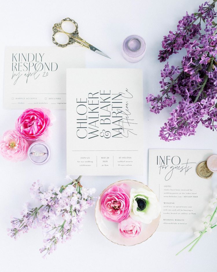
Photo by Marya Juliann Photography
16. Cream, Baby Blue, Grass Green & Violet
Venues: Gardens, Private Estates, Historic Buildings
Traditional, but certainly not boring, this color palette calls to mind English country estates and rolling fields of lavender — making it perfect for weddings that will take place on historic properties or in botanical gardens. To preserve the classic essence of the palette, keep cream as your main color and use baby blue, green, and violet as accent shades to be tucked into bouquets or small details like ribbons or trim on linens. We also love how this palette looks when paired with wedding invitations and stationery that feature custom crests and hand-drawn illustrations.

17. Dusty Blue, Navy, Blush, & Sage
Venues: Botanical Garden, Castle, Ballroom
While similar in essence to the last palette, this combination of colors has a more whimsical, storybook flair — making it perfect for couples taking inspiration from fairy tales for their wedding. Lean into the soft fantasy feeling by incorporating it into stationery rich with illustrations, vintage plates and table linens in floral patterns, and lots of lush pastel florals.
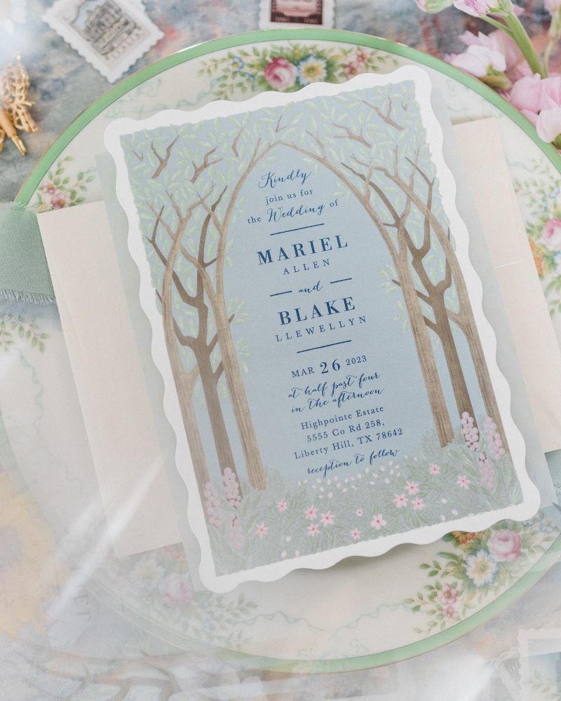
Photo by Carhart Photography
18. Slate Gray, Mauve & Burgundy
Venues: Botanical Gardens, Museums, Rooftops
Tying the knot in early spring means that there is always a chance of lingering winter weather making for a chilly and gray wedding day. This palette embraces the mercurial nature of the earliest days of the season and can help your decor feel perfectly placed for transitional weather. Use slate gray for bridesmaid dresses, groomsmen suits, chargers, and even pillar candles in your centerpieces. Then add lightness and dimension to your decor with floral arrangements that contrast mauve and blush pink with rich burgundy or dark fuchsia accents.
Photo by BN Photo & Video
19. Dove Gray, Pastel Blue, Peach, & Black
Venues: Backyards, Gardens, Museums, Beach
This is another palette that embraces cloudy spring days. But, unlike the color scheme we just discussed, it takes a lighter approach. A beautiful and sophisticated way to do pastels, think about incorporating these colors in a way that feels balanced — try to use a proportional mix of dove gray and pastel blue on your tables, for example, and then use peachy pink and light yellows to brighten everything up.

20. Grape, Coral, Peach, & Honeydew
Venues: Museum, Hotel, Vineyard
Unexpected and ultra-chic, this color palette is perfect for venues that have strong architectural details like museums or galleries, design-led hotels, and the indoor reception areas of Wineries. The key to getting this color palette right is to use grape as a punchy accent and do your best to find shades of coral, peach, and honeydew that are all in the same shade, which will help lend them a more monochromatic, neutral feel.

A Note on Pastel Wedding Colors: How to Make the Springtime Classic Feel Modern
It can be tempting to stick to pastels when you’re selecting a spring wedding color palette. They’re popular for a reason: No matter what else is happening in the world of fashion, pastels become their own trend almost every spring. They’re versatile, too. They work well for all kinds of wedding-planning media, from cardstock to cakes to rental furniture.
For a take on pastels that feels anything but expected, avoid pairing too many of them together without an interesting contrasting color. One of our favorite ways to do this is to pick one pastel shade and pair it with a deeper hue for the same color family for a modern, monochromatic look. For example, pair a powder blue with a deep navy, a mint green with forest green, or pale pink with a rich rose. This darker accent color will provide depth and sophistication to even the most spring-forward color choices.

Photo by Sawyer Baird
March Wedding Color Ideas
Minted’s Favorite March Color Palettes
- Slate Gray, Mauve & Burgundy
- Pastel Blue, Dove Gray, & Peach
- Turquoise, Melon, & Navy
March is the start of the season, but it can still be very chilly in most climates. This might mean opting for an indoor venue like a hotel ballroom, winery, or art gallery rather than a garden wedding. When it comes to building a palette around an indoor venue, let the existing colors of the space lead the way either by picking out a few of the accent colors to carry through as pops of color in your decor or by sticking to more neutral tones.
If you’re one of those people who loves the cool, blustery weather, go ahead and lean into the feeling of very early spring by choosing cool, elegant colors like pale grays or blues, or washed-out pinks. Pair with a neutral off-white or deep navy for a theme that’s classic and understated.
Photo by Heirlume Photography
April Wedding Color Ideas
Minted’s Favorite April Color Palettes
- Dove Grey, Pastel Blue, Peach, & Black
- Lavender, Marigold, & Olive Green
- Cream, Baby Blue, Grass Green & Violet
- Pistachio, White, & Mauve
April is known for its showers, so this may also be a compelling reason to choose an indoor venue…or at least make sure you have a solid contingency plan in case of rain. If that is the route you choose, the same advice applies: pay attention to the colors that already exist in your venue and choose a palette that compliments them. This is especially important if you've chosen a venue that is less of a blank canvas and more of an architectural masterpiece.
When it comes to narrowing in on the best color scheme, you could even choose to make “April showers” your theme. For this theme, you could go with colors that mirror moody, cloudy skies like slate gray, fresh white, or deep blues. Or, you could get inspired by the soft pinks, yellows, and blues of the sky just after the rain begins. Finally, for an April wedding, you can lean into the fresh energy that comes with spring’s early blooms with a palette full of lively greens, fresh purples like lilac and lavender, and soft pinks.
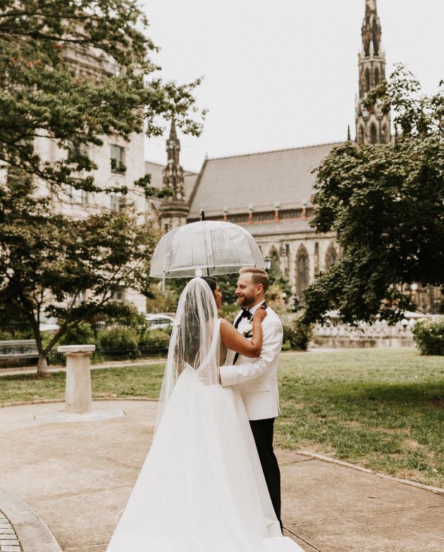
Photo by Barbarah Perttula
May Wedding Color Ideas
Minted’s Favorite May Color Palettes
- Peach, Magenta, Coral, & White
- Marseille Blue, Rose, Olive Green & Red
- Lime Green, Cream & Espresso
- Hunter Green, Bubblegum, & Rose Gold
May is when the season’s colors are out in full bloom — and many couples choose to opt for more vibrant color palettes to match warmer, sunnier days. For couples tying the knot in May, we recommend incorporating at least one bold and bright hue into your lineup for the day as a nice way to inject energy and liveliness into your ceremony and reception. If you’re feeling bold, you can pair a few — like Marseille Blue and Red or Hunter Green and Bubblegum Pink — and use them across unexpected accents like chargers, glassware, and day-of stationery.
Photo by Rebecca Skidgel Photography
Your Perfect Color Palette
There you have it! We hope this article left you feeling inspired and empowered to choose the perfect spring palette for your wedding day. If you’re still feeling unsure, remember that there are really no hard-and-fast rules when it comes to picking the perfect palette for your big day. When in doubt, start with a few of your favorite shades, and then build from there until you find something that feels like a perfect encapsulation of you and your spouse-to-be!


